

Nordic Ski
Full Design Cycle
Startup
B2B
B2C

Industry overview
I've been a cross county skier my whole life and this sport is one of the oldest winter sports and one of the best cardiovascular exercises that you can do. Its popularity comes from its simplicity and healthiness. All you need is a pair of skies and poles and off you go. Of course you need snow which is only available for people living in locations with snow. However, it's been growing in popularity in the US and the people I interviewed described it as peaceful, exhilarating and adventurous. In addition you're getting a great workout.
Challenge
If you are a cross country skier you know that to navigate most ski trails you need a printed map, which is inconvenient in so many ways. For example, it's impossible to know exactly where you are on a printed map (without the GPS functionality). It's also frustrating that every time you want to look at the printed map you have to unfold it and it therefore easily gets wet and ripped. In addition, in order for cross country skiers to track their runs they rely on apps that are created for running, hiking, biking etc. However, these apps are not optimized for cross country skiers since they're not getting the true trail details.
Opportunity
I went on a journey to discover if the experience for cross country skiers could be improved through a technology solution, and that's how the NordicSki.io idea was born. The app would help cross country skiers find Nordic ski centers and trail maps that includes GPS functionality, ability to check trail conditions, find ski tutorials and track their runs. No more printed maps... hurray!
My role
I led this project as the sole UX researcher and designer by conducting and analyzing user research to create user personas, user flows and wireframes, followed by designing a high-fidelity prototype which was tested by users.
Design tools utilized
To streamline our processes and maximize collaboration we utilized the following tools:

Figma

Miro

Maze

Optimal
Workshop

Milanote

UXPressia
Process
I included all stakeholders from the very beginning to eliminate as much friction as possible. This also made the handoff to the dev team easier, since they were included in the process.
01. Empathy
Quantitative research
Competitive analysis
User survey
User interviews
02. Define
Affinity maps
Empathy maps
Personas
HMW questions
03. Ideate
Brainstorming
Sketching
User stories
User flow
04. Design
Wireframes
Design System
LoFi Prototypes
HiFi Prototypes
05. Test
Usability testing
Iterate
More testing
Iterate
06. Conclusion
Is this idea viable?
Summary
Final thoughts
Lessons learned
01. Empathy
Quantitative Research
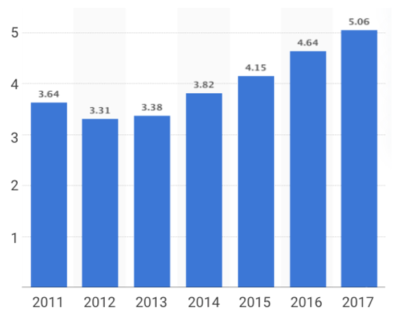
I conducted quantitative research in order to get a general overview of this industry. The data I found was collected from various online sources.
Number of XC skiers in the US (in millions)
Why do people cross country ski?
It is one of the oldest winter sports and one of the best cardiovascular exercises that you can do.
Its popularity comes from its simplicity and healthiness.
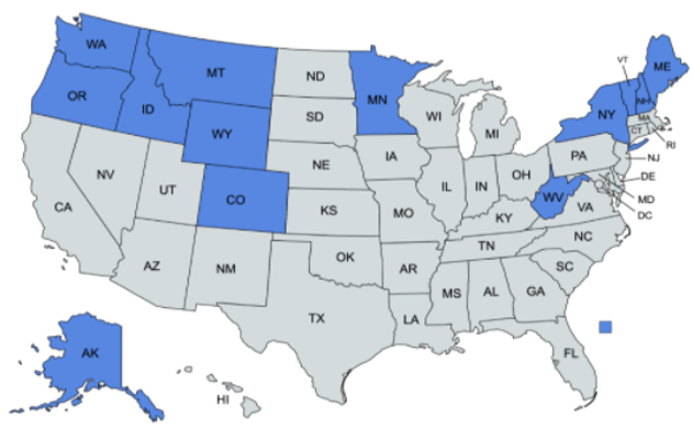
Where in the US is XC skiing popular?
(in blue)
Who goes XC skiing?
XC skiing is extremely popular in Norway, Canada, Germany, Sweden, Finland and Russia.
Skiers by gender in the US (%)
Male (63.8%)
Female (36.2%)
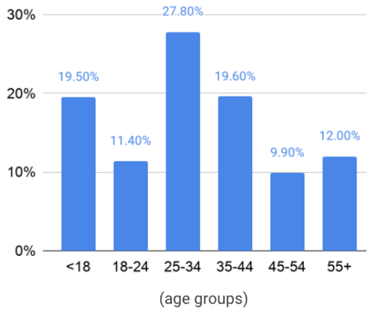
Skiers by age (%)
(in the US)
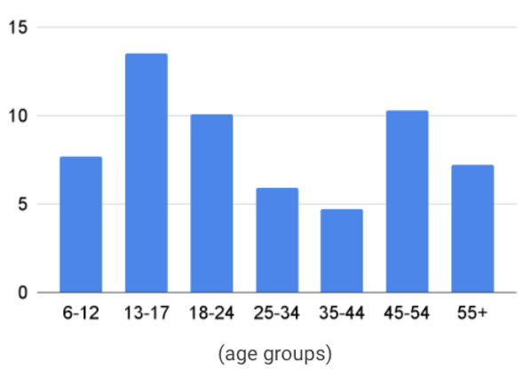
Average times/year different age groups go skiing
(in the US)
Competitive Analysis
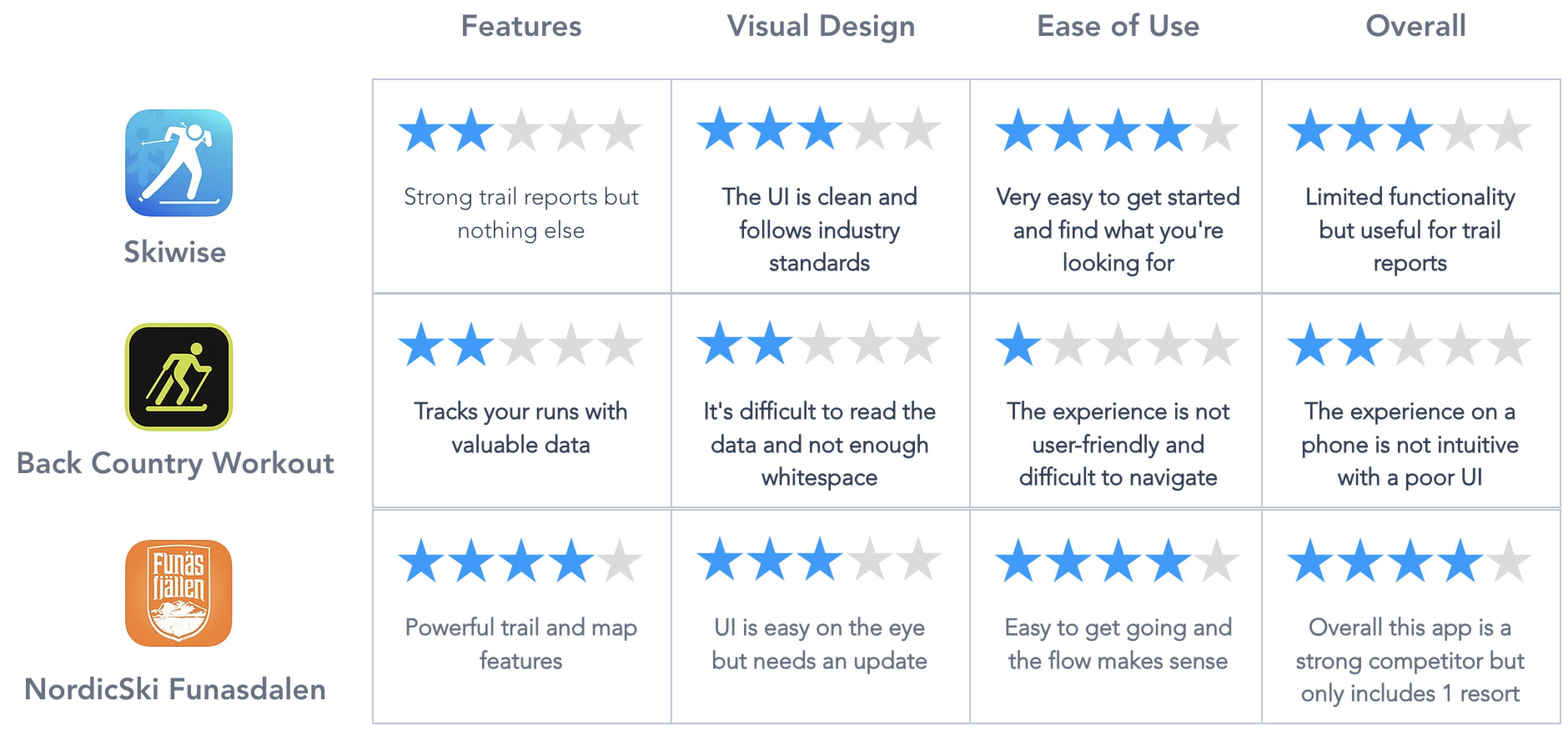
Through quantitative and qualitative research I identified the top apps that are used to enhance the cross country ski experience. There are other apps that do a great job tracking ski runs but they are more designed for running, hiking and biking. For this analysis I only included apps that have cross country skiers as their primary audience.
General Analysis of Competitors
Heuristic Analysis of Competitors
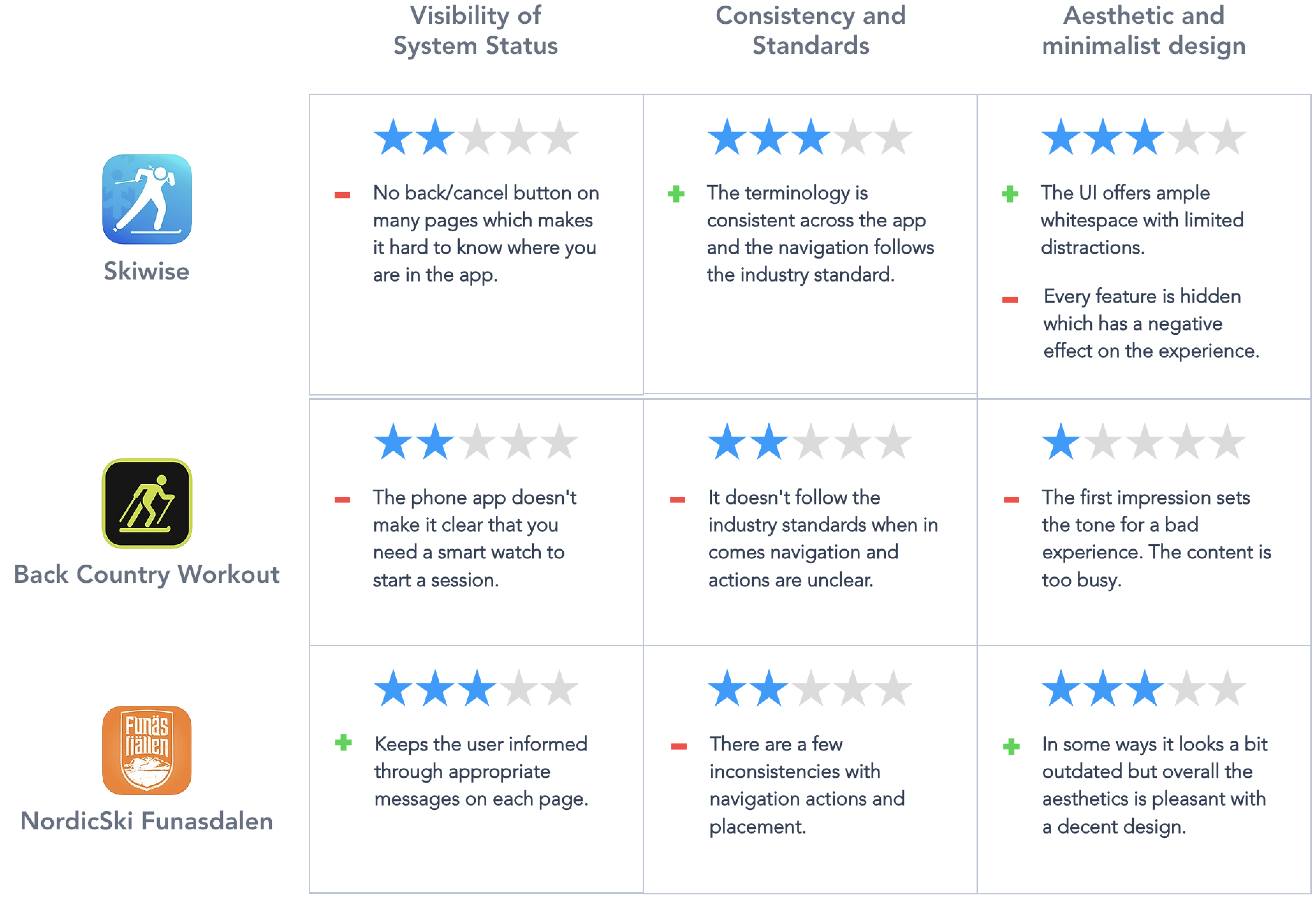
I based my analysis on the following usability heuristics:
Visibility of system status: the design should always keep users informed about what is going on, through appropriate feedback within a reasonable amount of time.
Consistency and standards: Users should not have to wonder whether different words, situations, or actions mean the same thing. Follow platform and industry conventions.
Aesthetic and minimalist design: Interfaces should not contain information which is irrelevant or rarely needed. Every extra unit of information in an interface competes with the relevant units of information and diminishes their relative visibility.
Qualitative Research
In-person interviews were conducted as well as a survey in which cross-country skiers were asked about their experiences and feelings associated with cross country skiing in general. I also asked them about other apps they're currently using to navigate ski trails and track their runs. These interviews and survey helped me identify the current pain points and I also identified a few items that I hadn't thought about earlier, that influenced the final app prototype.
Survey
I received approximately 40 responses
90%
go skiing at least weekly during ski season
79%
use apps on their phone at least 3 times/week
75%
consider themselves as expert skiers
73%
Go skiing with family and friends
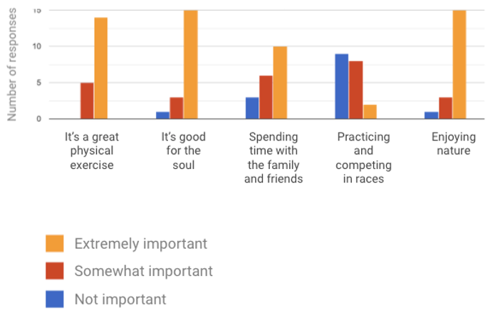
When you go XC skiing, how important are the following statements?
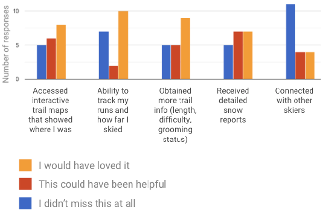
The last time you went skiing, which of the following did you wish you could have done through your phone?
Interviews
The screener survey helped me to identify the top five most suitable interview candidates, to make sure I had a diverse audience. Each interview was done through Google Meet and lasted for approximately 30 min per interview. I had a script and a timeline that I followed strictly. Three of the interviewees allowed me to record the sessions.
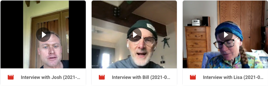
Interview Summary
All the participants live within 1 hour of XC ski trails
Their experience ranges from 10 years to 35 years
Their age ranges from 38 - 77 years old
All of them have used an app to track their XC ski experience
The main challenge they all had was to get better trail info and snow conditions to optimize their experience
Their comments and thoughts are summarized below in the Define section
02. Define
Affinity Map
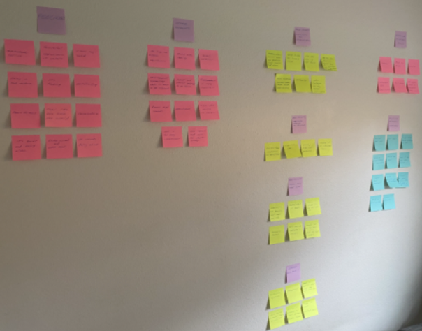
Based on all the comments that I received from the interviews, I broke down the affinity map into four categories:
Feelings
Challenges & pain points
Existing tech solutions (a.k.a. competitors)
Existing features
To the right you can see the affinity map in full action, broken down into four sub categories.
Empathy Maps
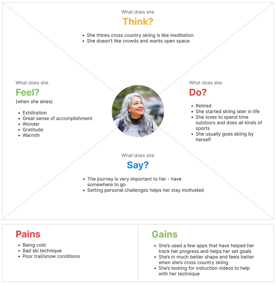
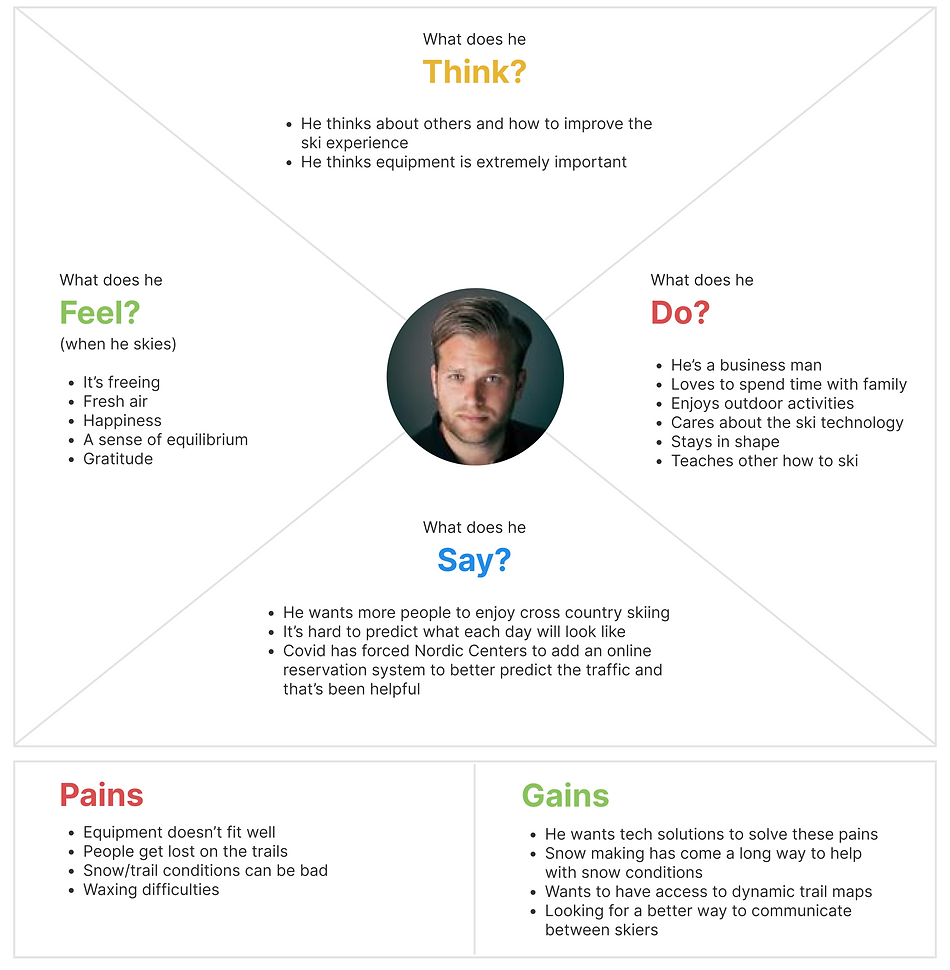
All the things I had learned about our users (interviewees) were summarized in two main user empathy maps in order to dig deeper into how they think, feel, say and do. In addition I also included their pains and gains.
Healthy Lisa
Harold the Ski Lover
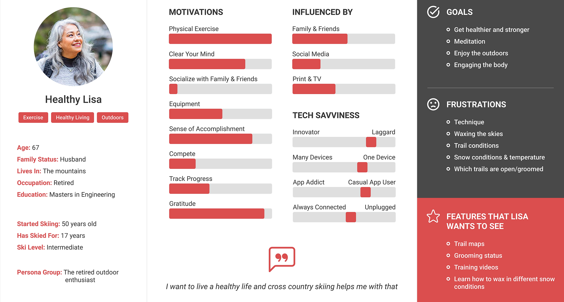
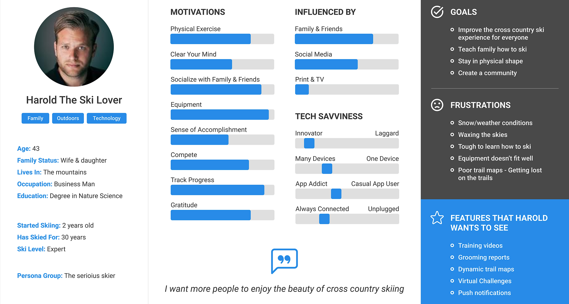
Personas
Taking what I learnt from our interviews and empathy maps I created two personas that represented the majority of the interviewees and survey respondents
Healthy Lisa
Harold the Ski Lover
Research Conclusion
There was a clear opportunity for us to improve the experience for cross country skiers. However, it was crucial that we partnered with a Nordic Ski Center to reach our audience and maximize our success. Below I listed our top 5 insights that led to our "how might we questions", which helped us with the ideation phase.
Top 5 Insights
Very few skiers like printed maps and wish there was an alternative to navigate the ski trails
Predicting the trail/snow conditions is very difficult
It is easy to get started with skiing but hard to become a great skier
It is challenging to know what type of wax to use for the skies
There is no easy way to challenge skiers virtually
How Might We Questions
How might we help skiers more easily find the ski trails and know where they are?
How might we help skiers find out which trails are open/closed and inform them about trail conditions?
How might we make it easier for skiers to improve their ski techniques?
How might we help skiers have a better wax experience in all types of weather?
How might we allow competitive skiers to participate in virtual contests?
03. Ideate
Brainstorming & Sketching
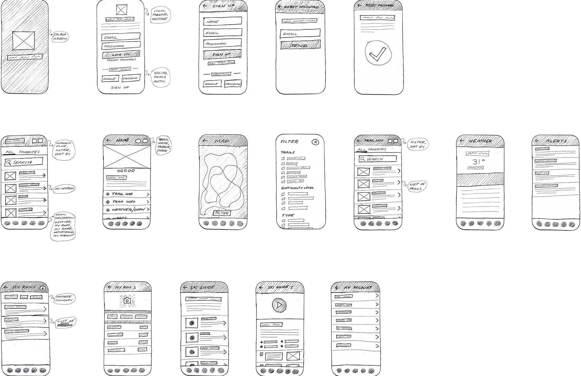
The time has come to put pen to paper and sketch out all the ideas that came to mind based on the "how might we questions" and top insights from the research I conducted.
The main sections I focused on for sketching were:
Onboarding
Explore (find Nordic ski centers and trails)
Detailed trail information
Activities (track runs)
Video tutorials
Favorites (centers, trails, tutorials)
User Stories
To highlight the user needs I wrote short User Stories to help identify the most valuable features of my product, in order to help users become a better version of themselves.
As a cross country skier I want to have access to an interactive map on my phone with GPS functionality, so I know where I am on the trail
As a cross country skier I want to be able to see trail/snow conditions before I go skiing, so I can better plan my ski trip
As a cross country skier I want to improve my ski technique so I can ride faster and be less tired
As a cross country skier I want to become better at waxing my skies, so I can get better grip and glide
As a cross country skier I want to be able to compete against other skiers in a virtual environment
User Flow
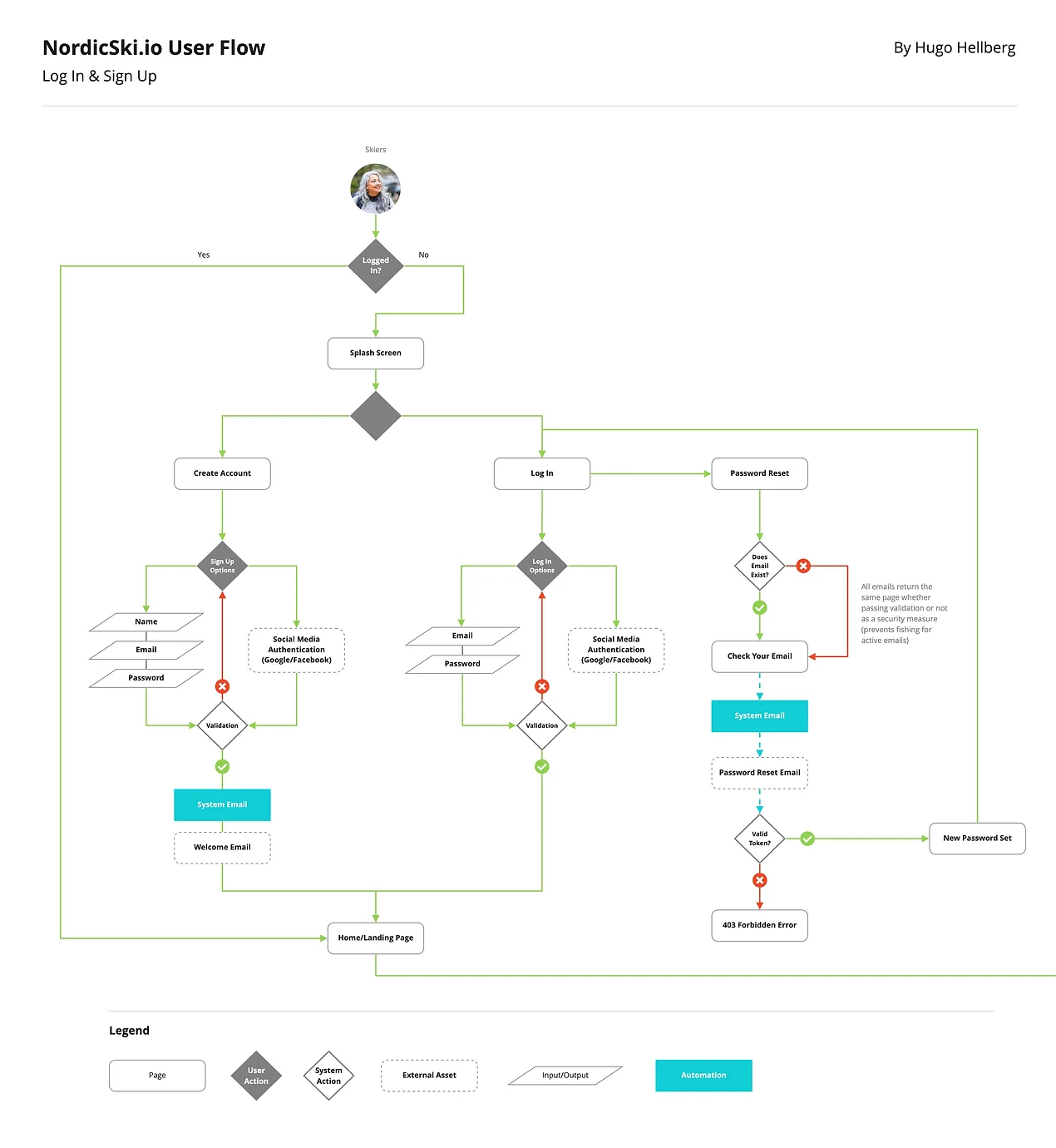
I created a user flow diagram to show “red routes" (or primary tasks) that users would take in the Nordic Ski app to find Nordic ski center, explore the ski trails, add an activity and view tutorials.
04. Design
Wireframes
Next up was transforming my sketches into digital wireframes to better represent my designs and how users interact with the product.
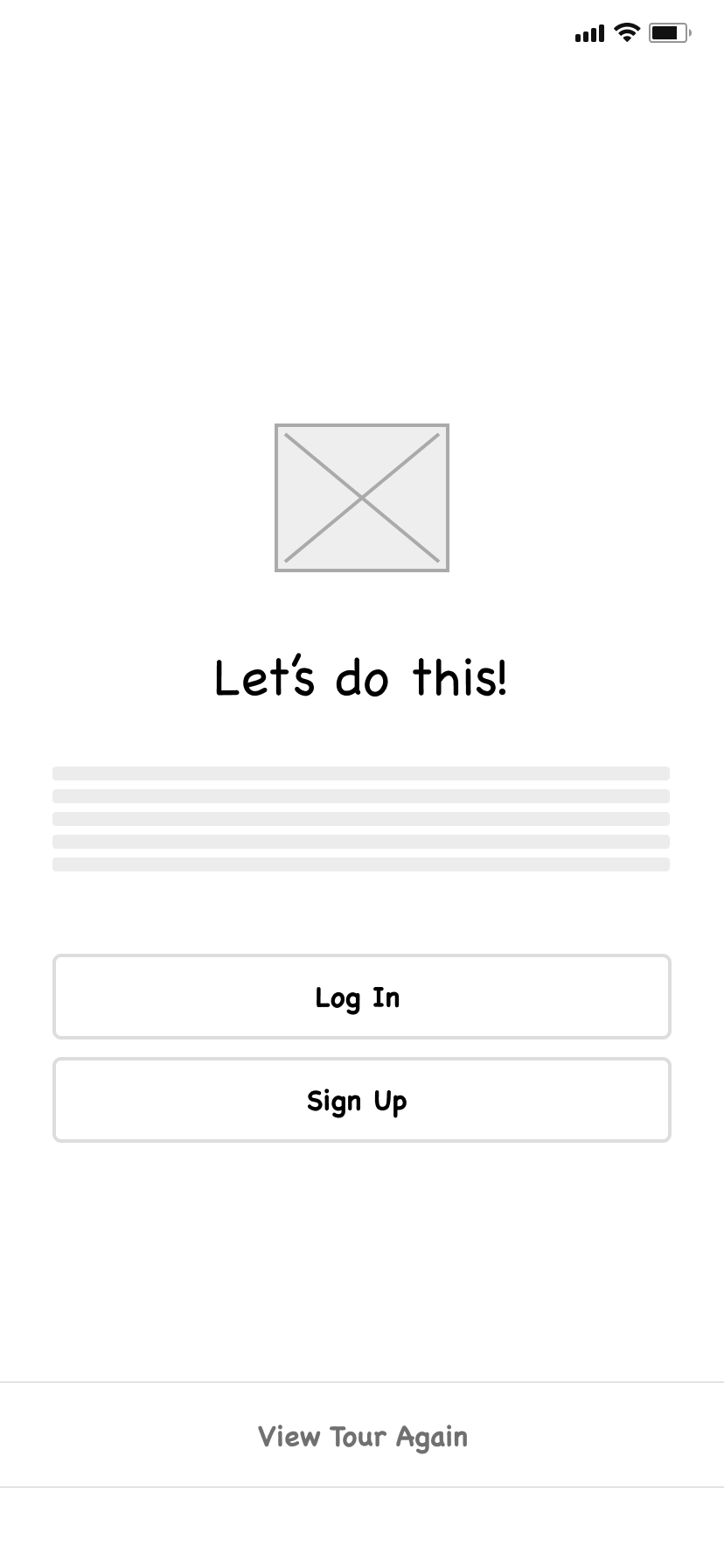
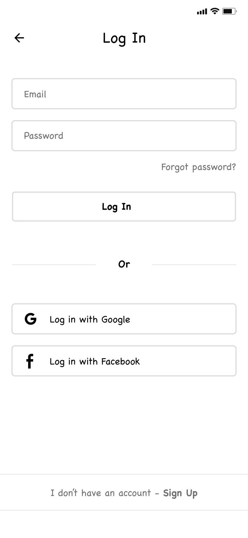
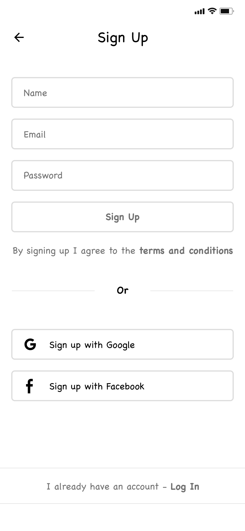
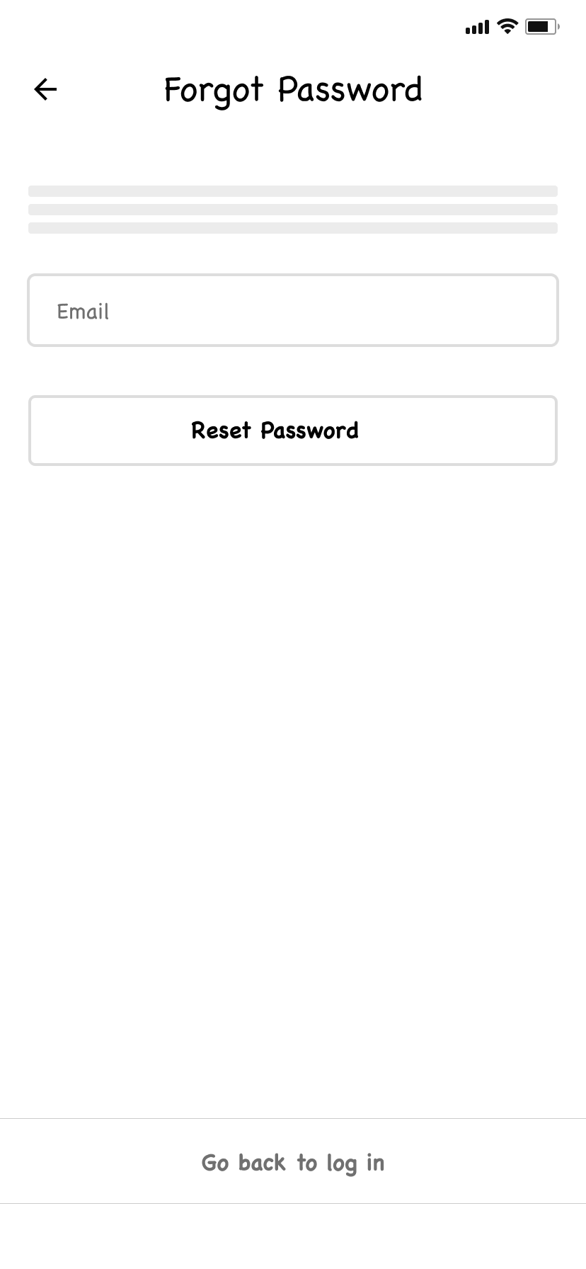
Onboarding & sign up / log In screens
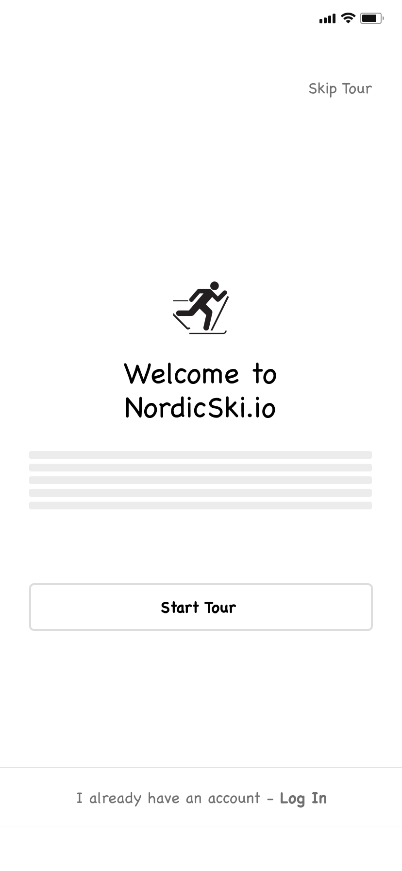
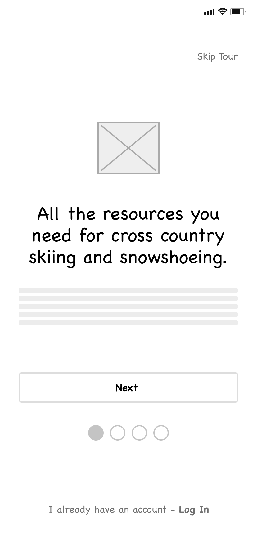
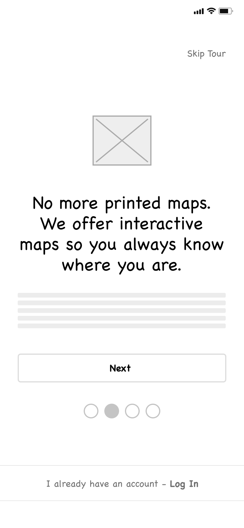
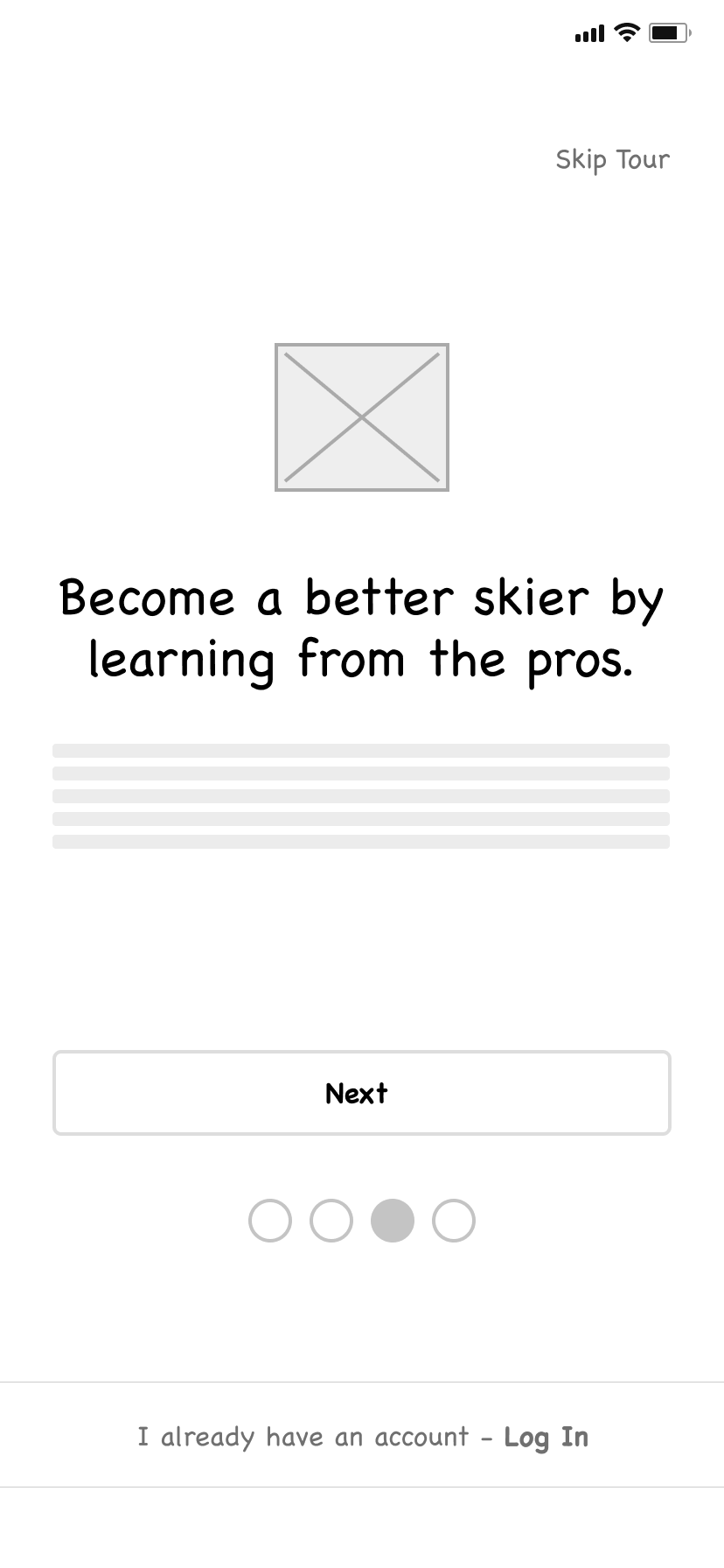
I wanted to have some type of welcome screen that would allow users to start an onboarding tour or go straight to log in.
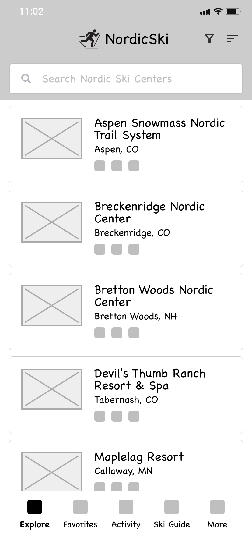
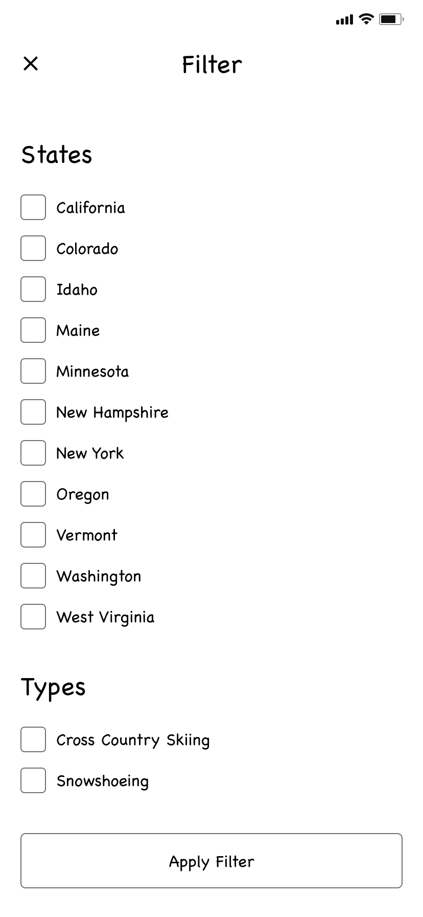
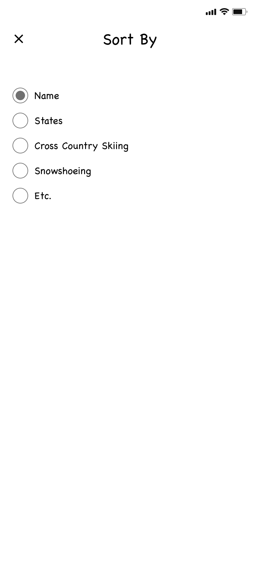
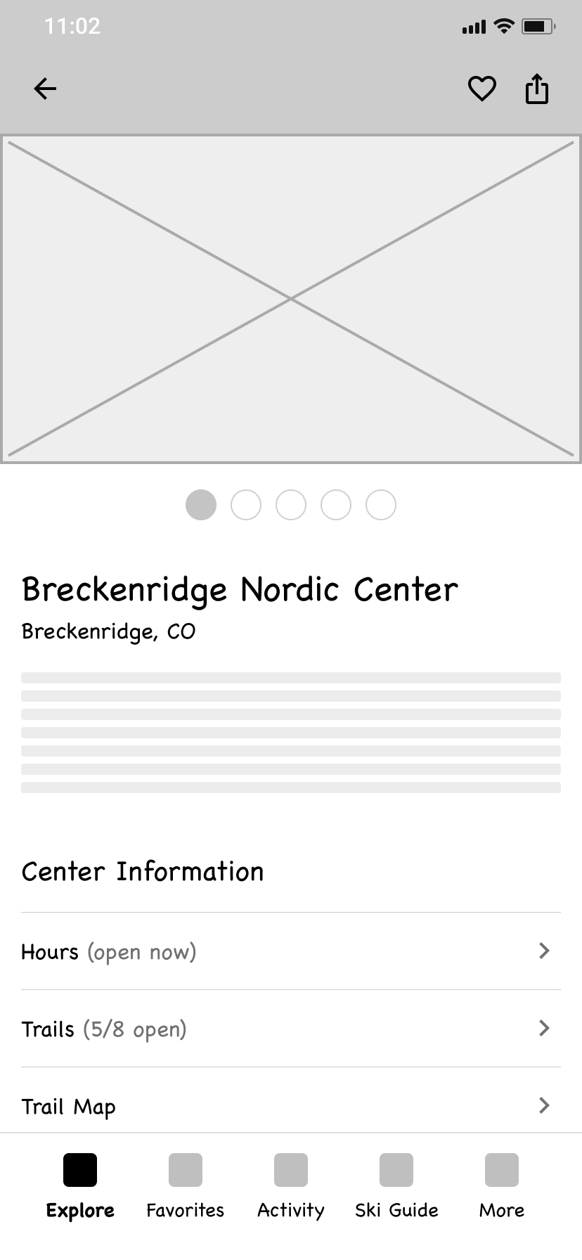
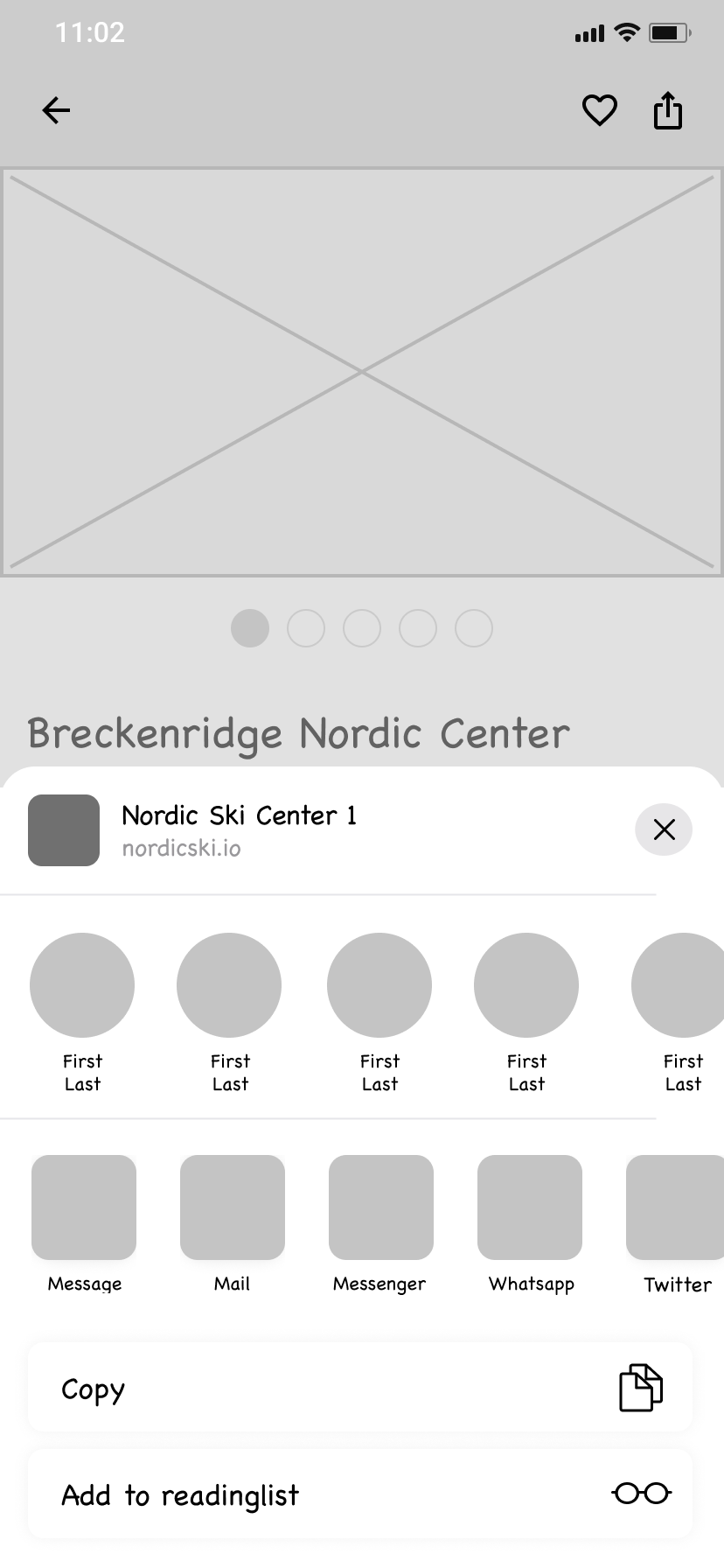
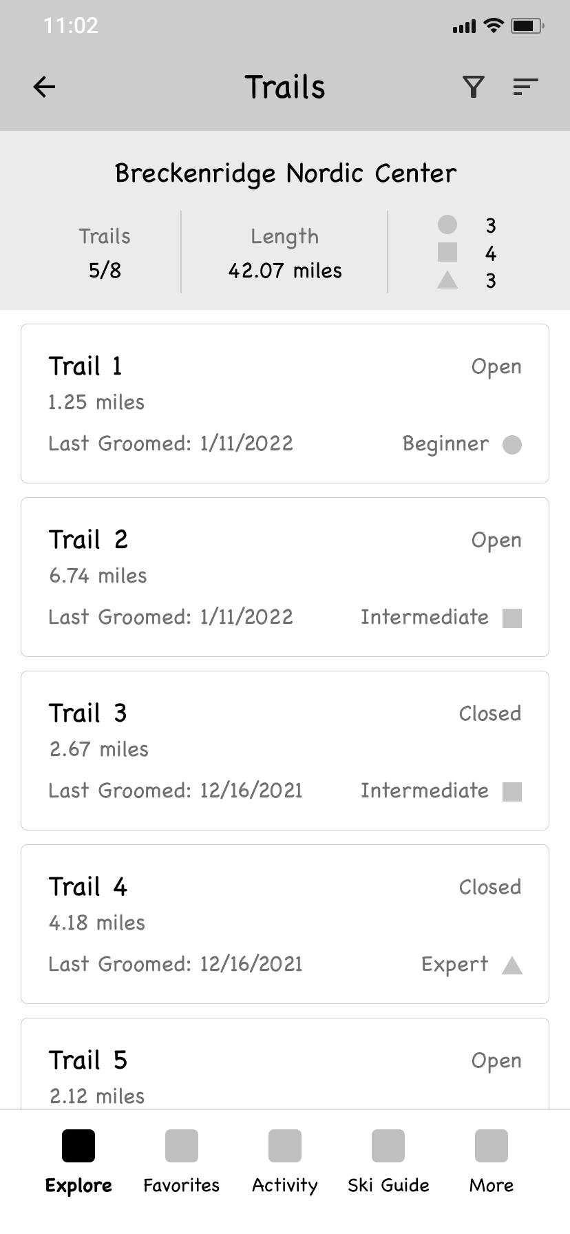
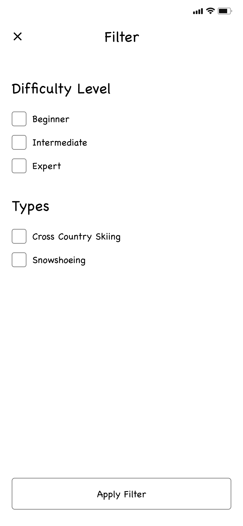
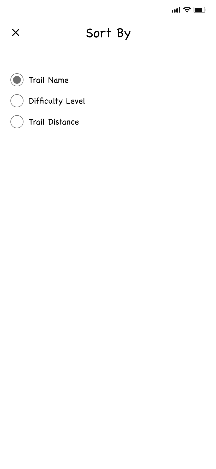
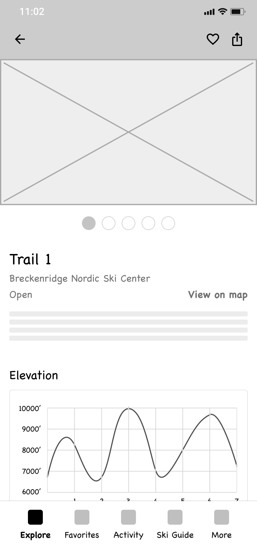
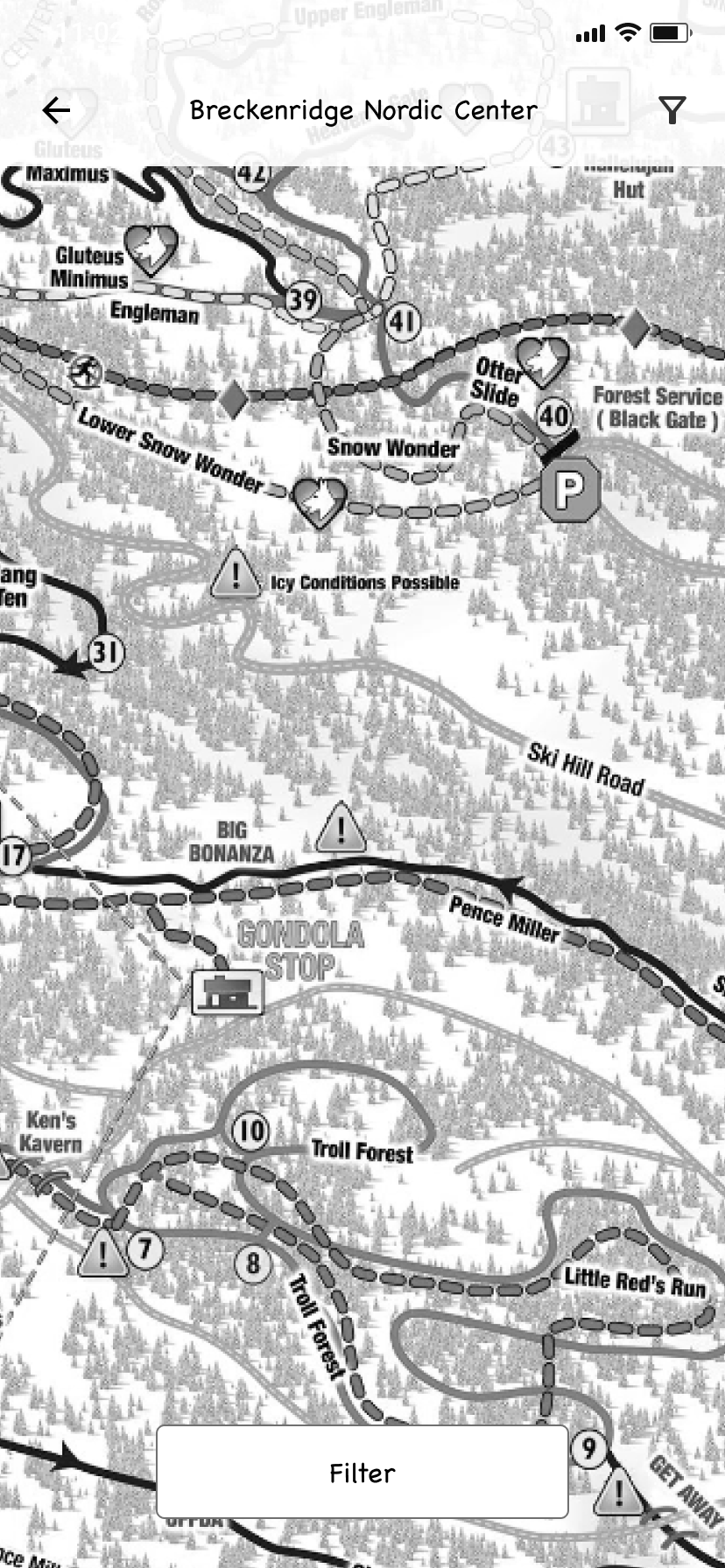
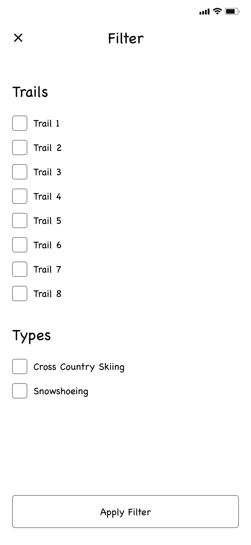
Explore screens
It was important to allow users to quickly find and explore Nordic ski centers and trails
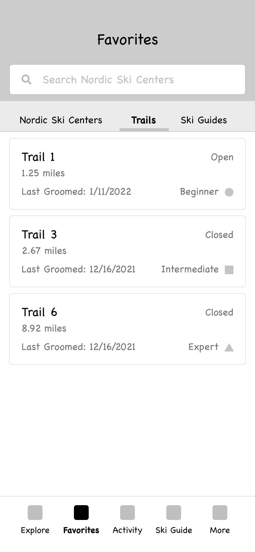
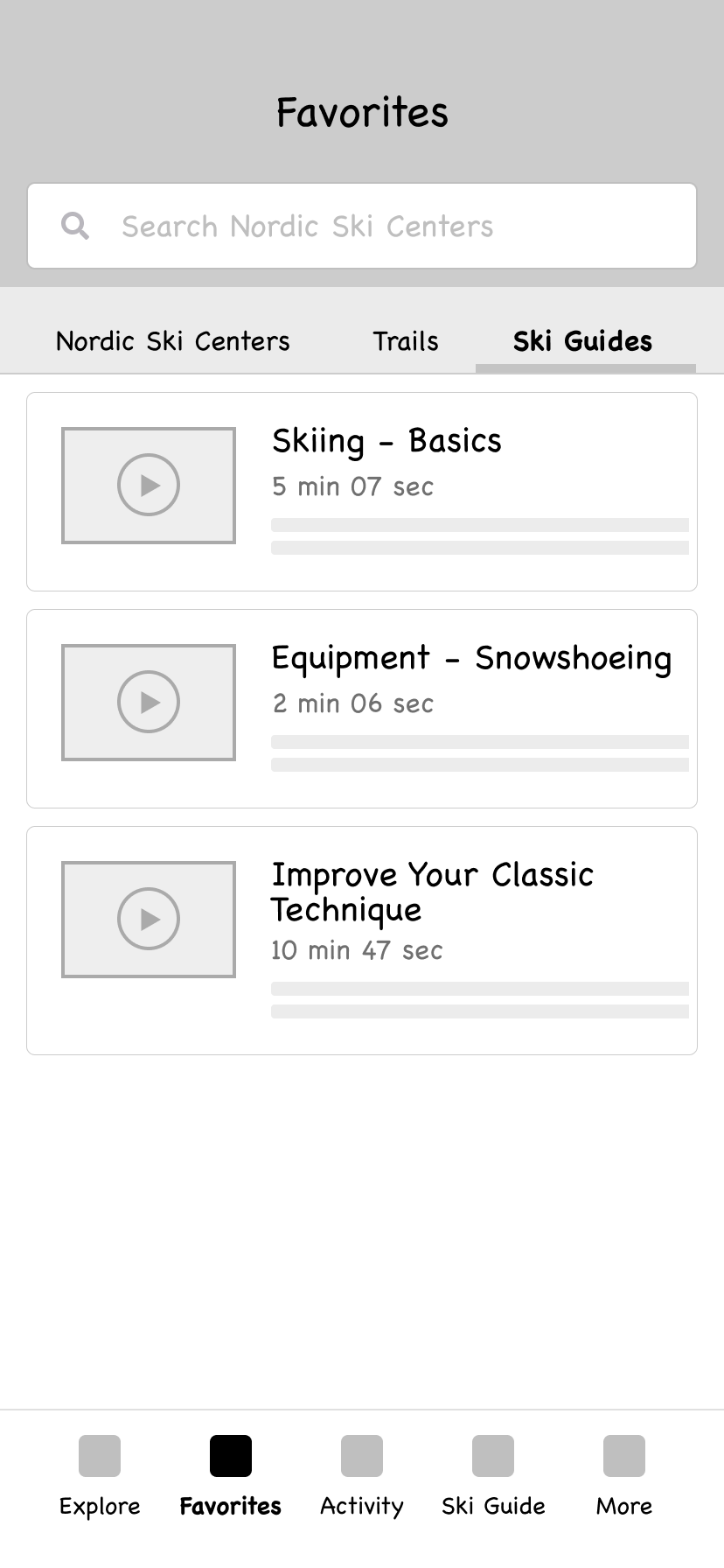
Favorites screens
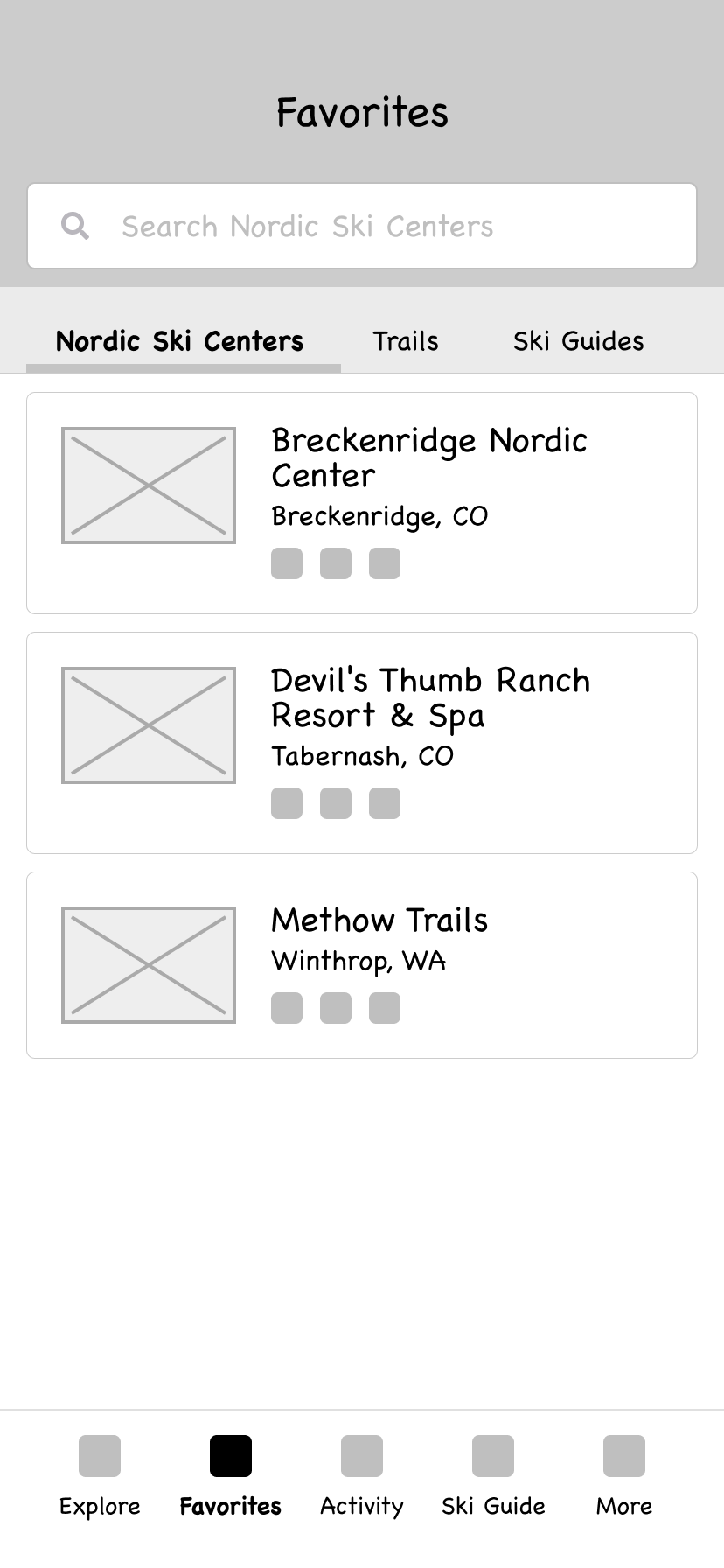
A quick way for users to access their favorite centers, trails and tutorials seemed valuable
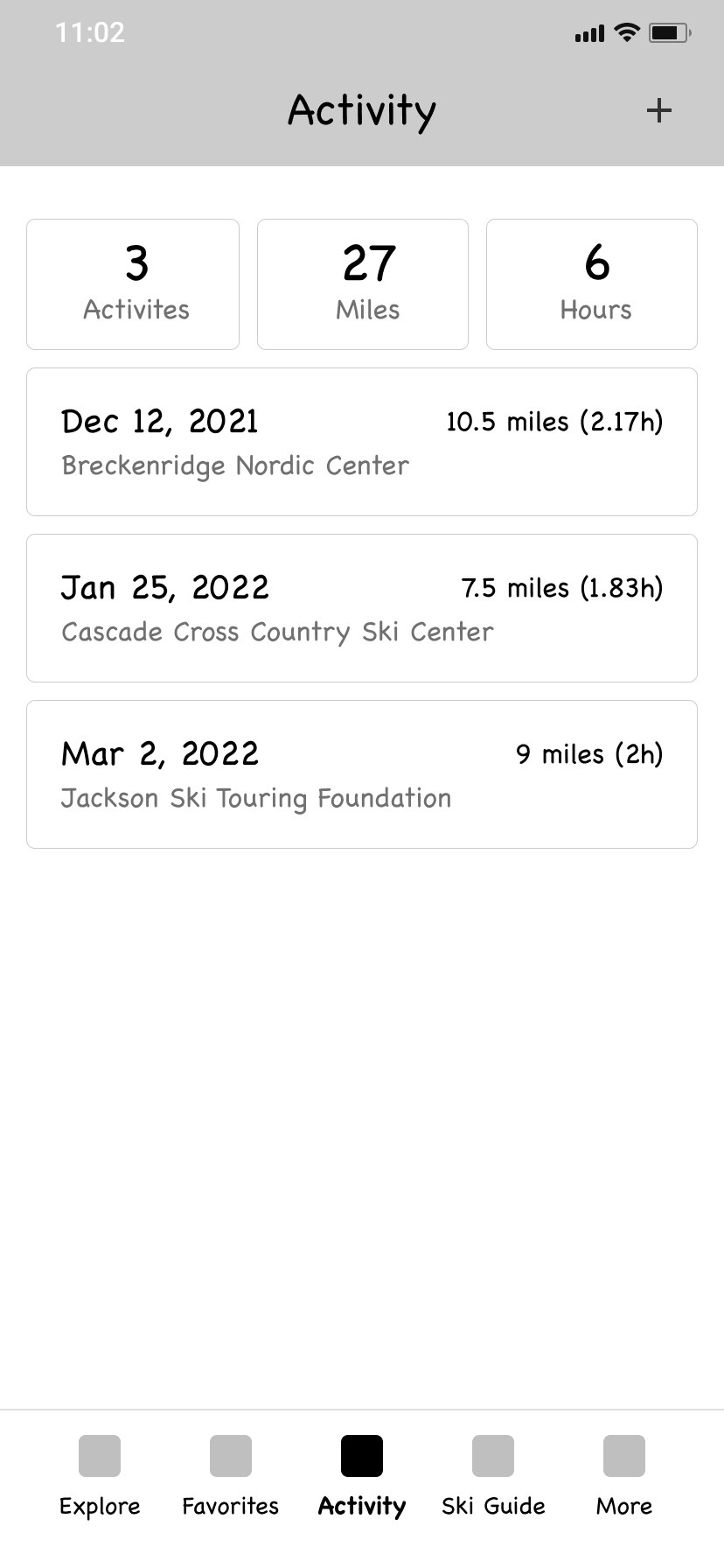
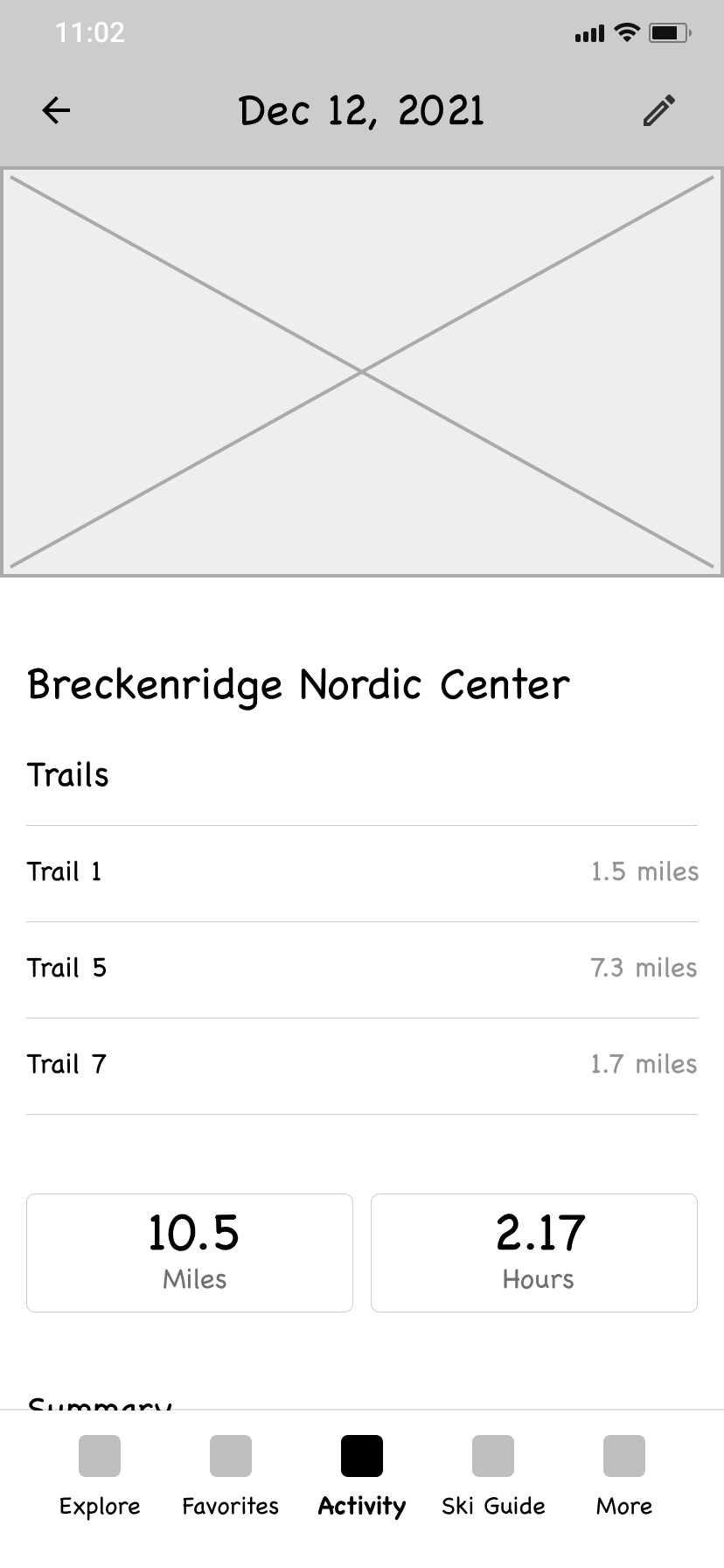
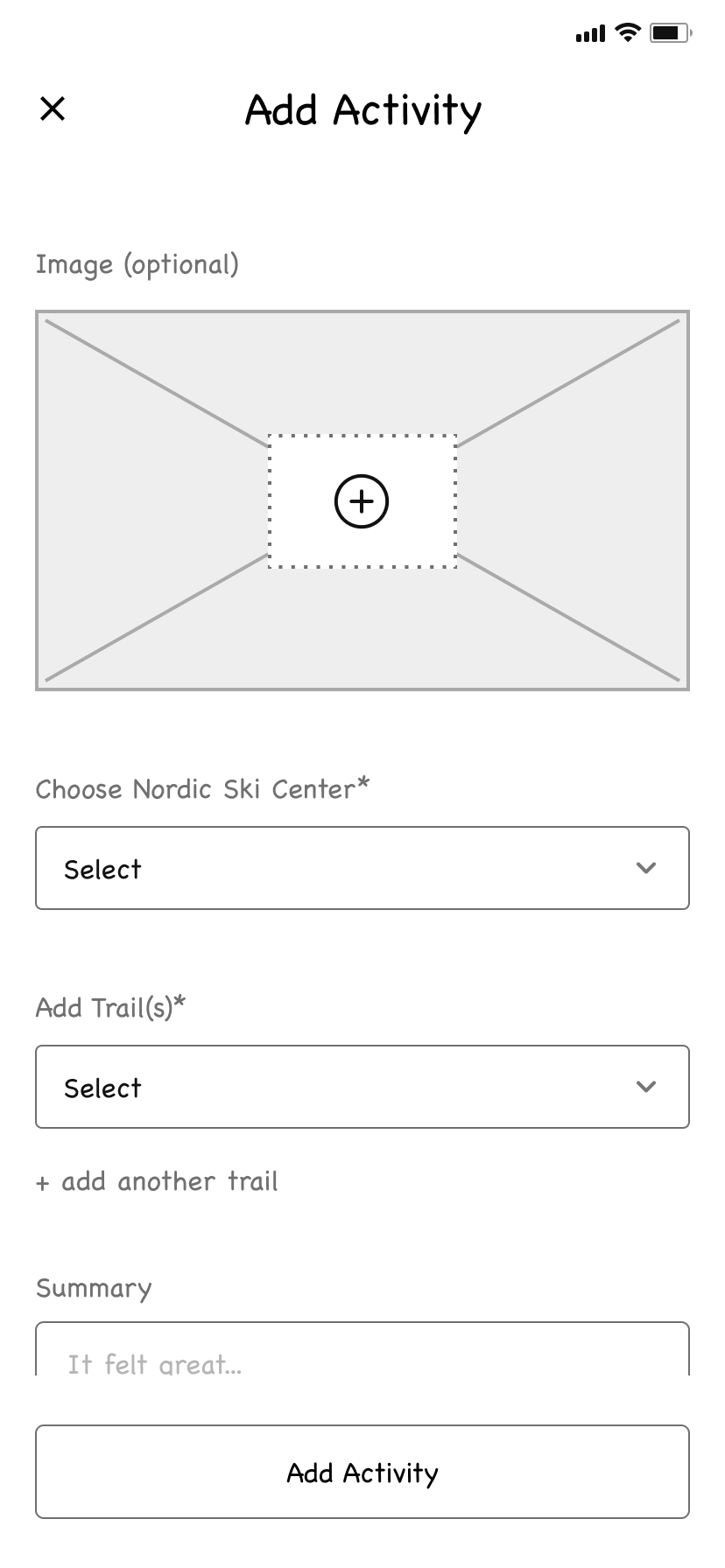
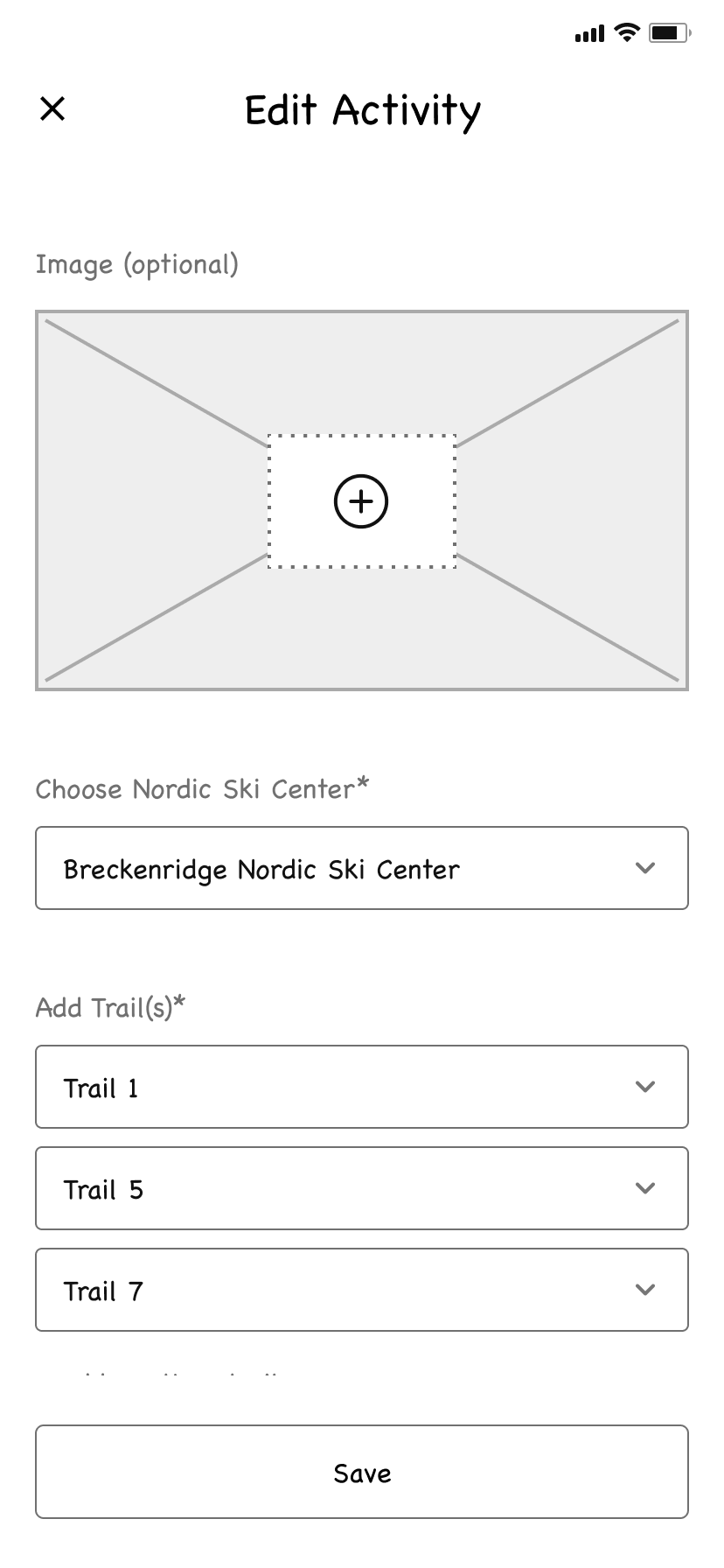
Activity screens
One of the talking points that kept coming up with the users we interviewed was to be able to track their runs with better trail information connected to the runs
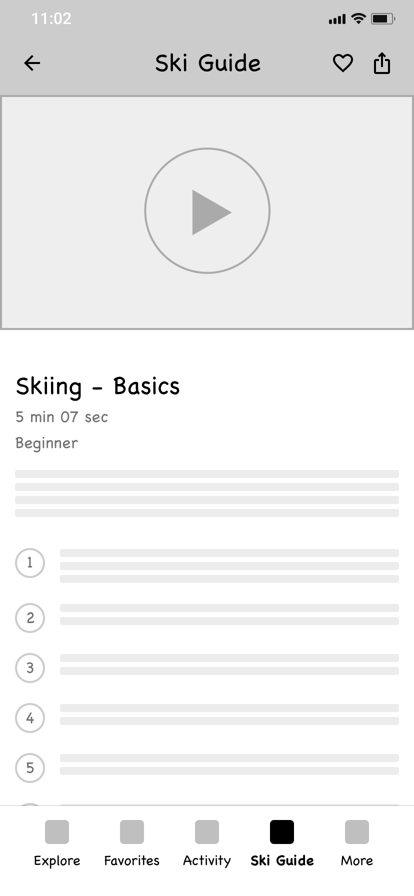
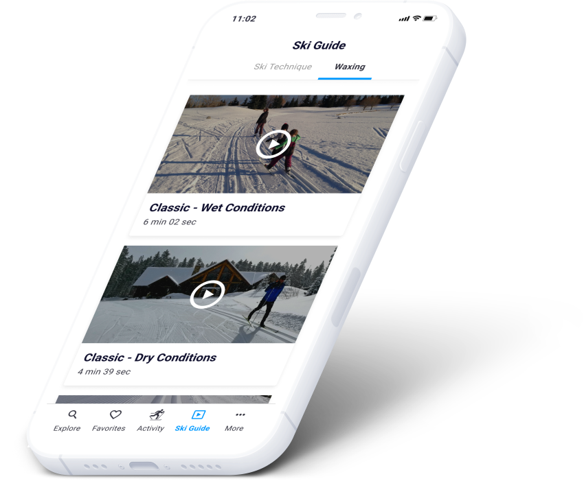
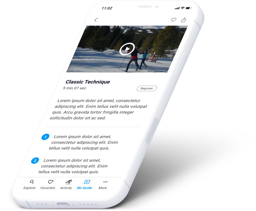
Tutorials screens
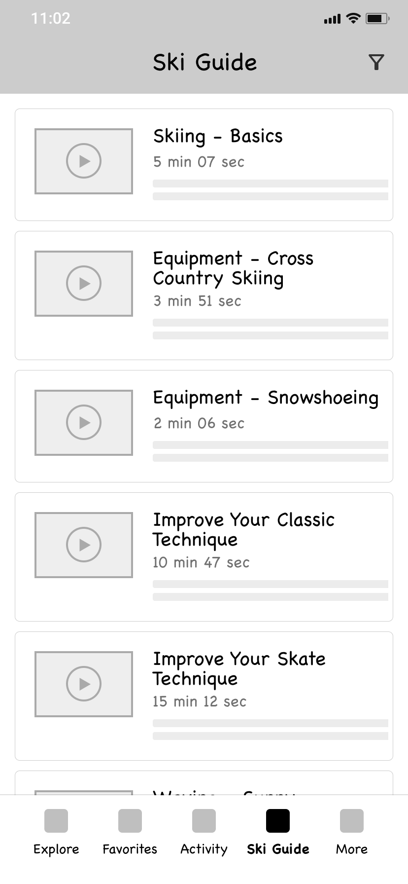
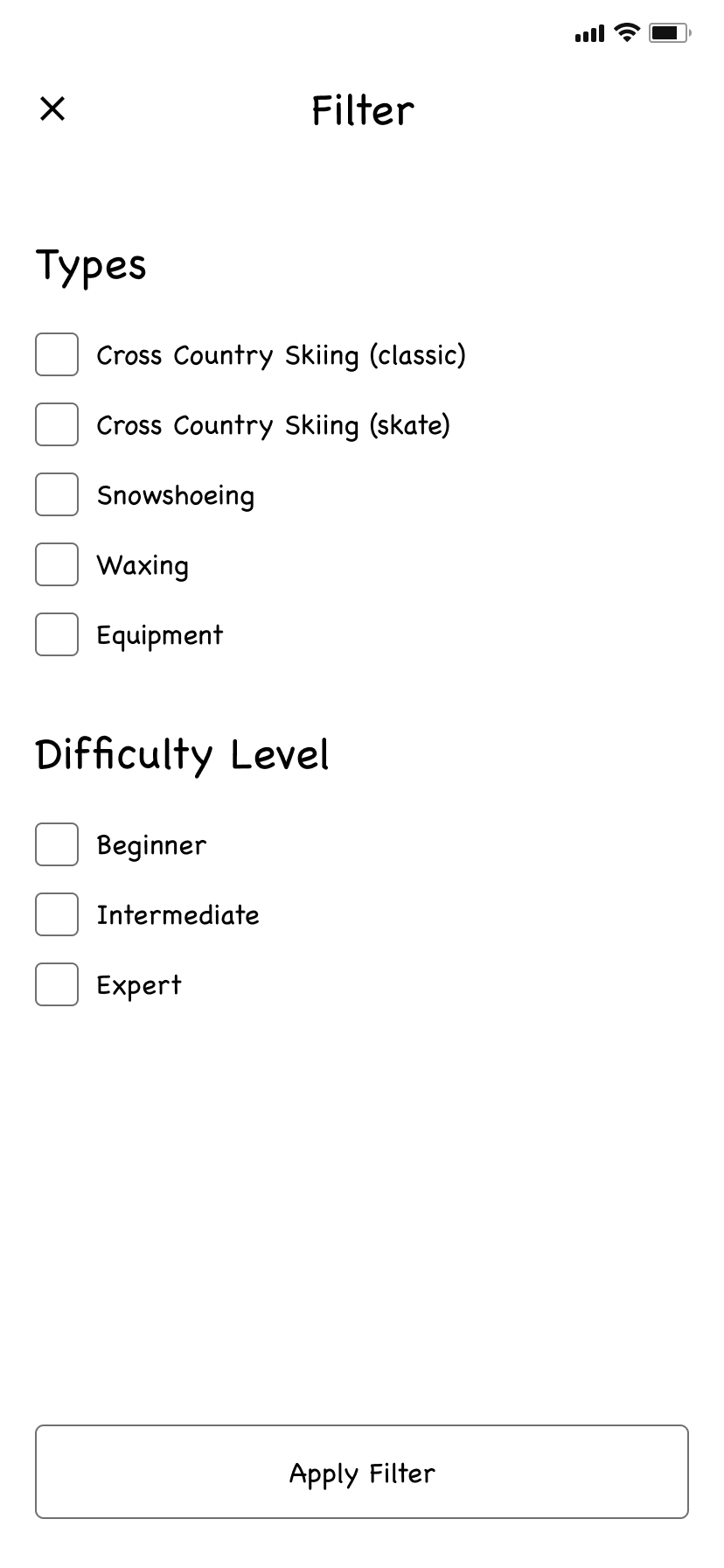
This would allow users to view tutorial videos on how to improve their ski technique as well as wax instructions and tips
Design system
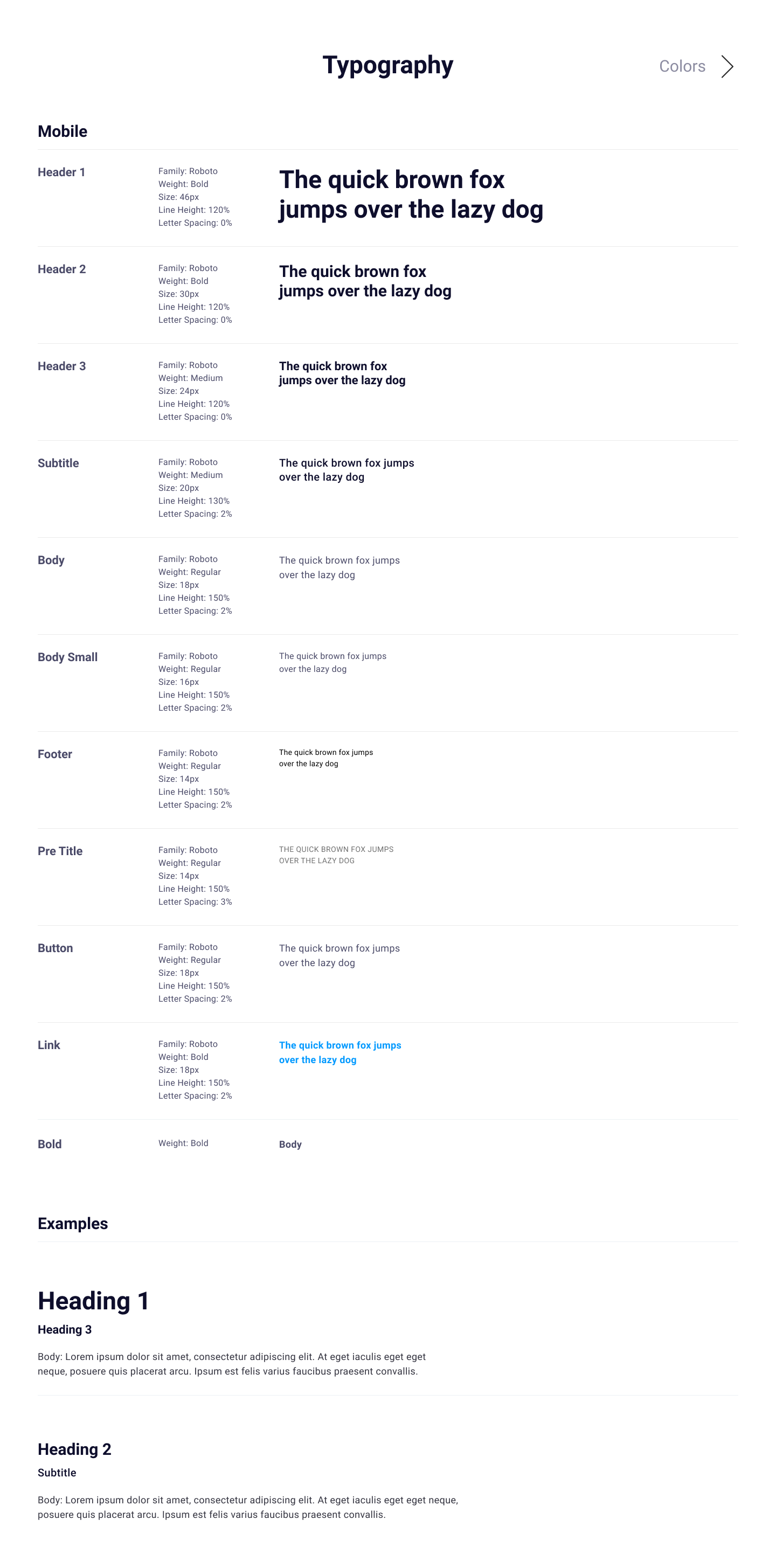
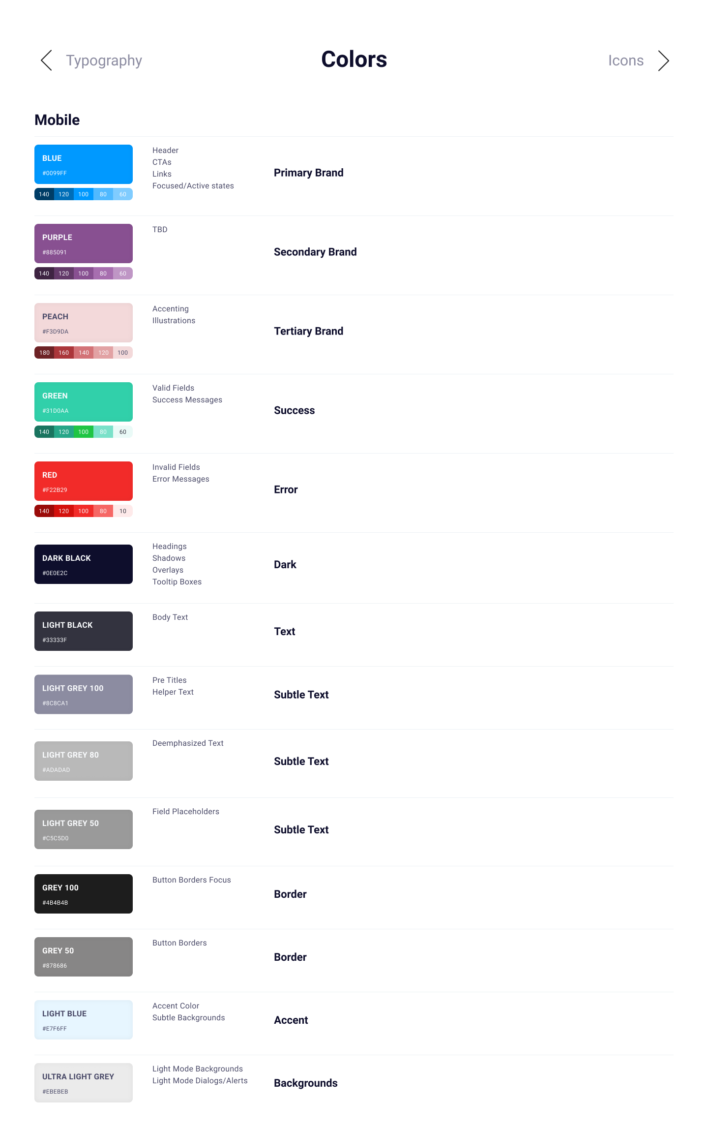
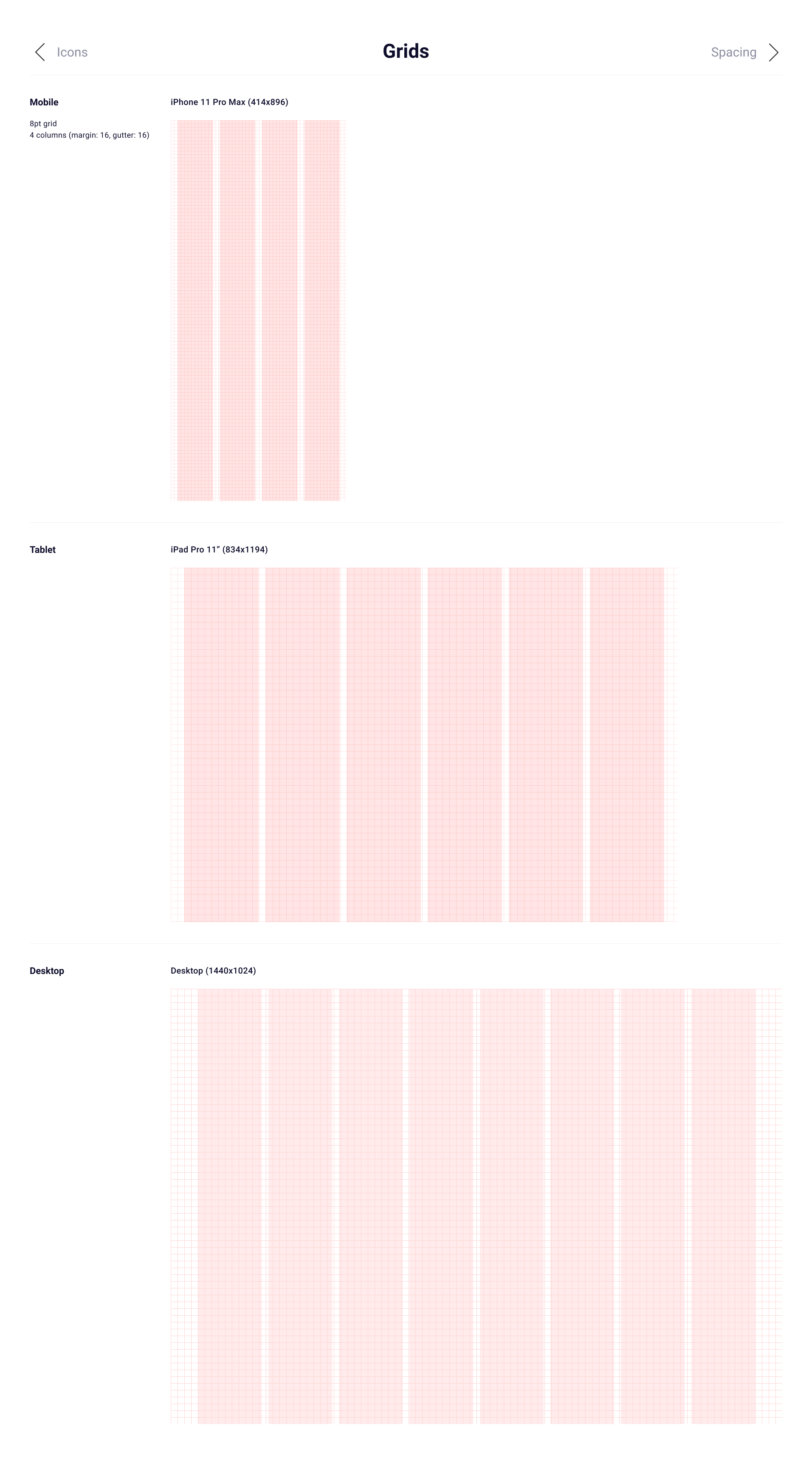
To make the process as streamlined as possible, I built a robust design system with a style guide (typography, colors, grids and icons), reusable components and finally patterns (which included multiple components combined that formed larger components)
Style guide
I used Figma to build our style guide, including typography, colors, grids and icons
Typography
Colors
Icons
.png)
Grids
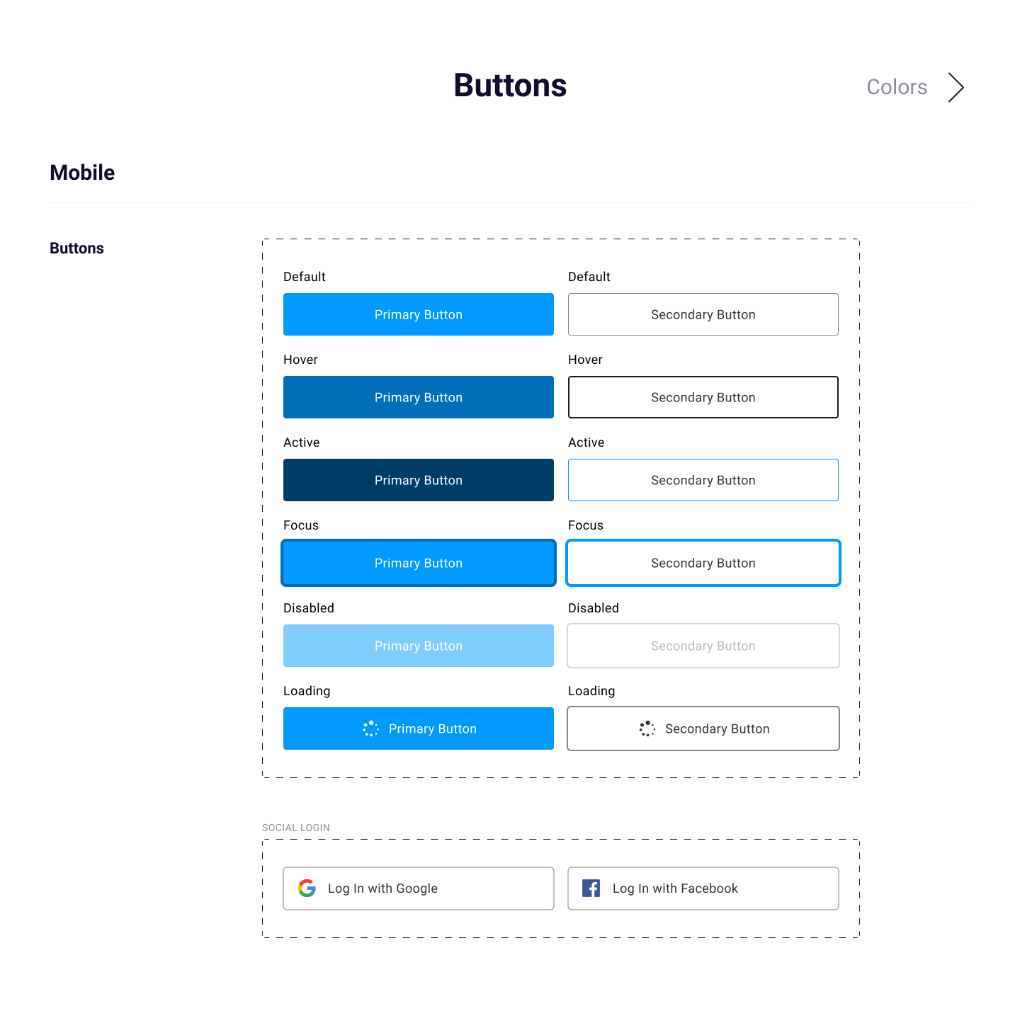
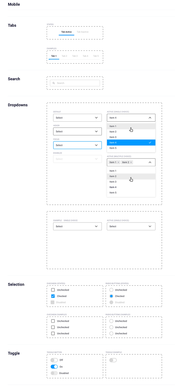
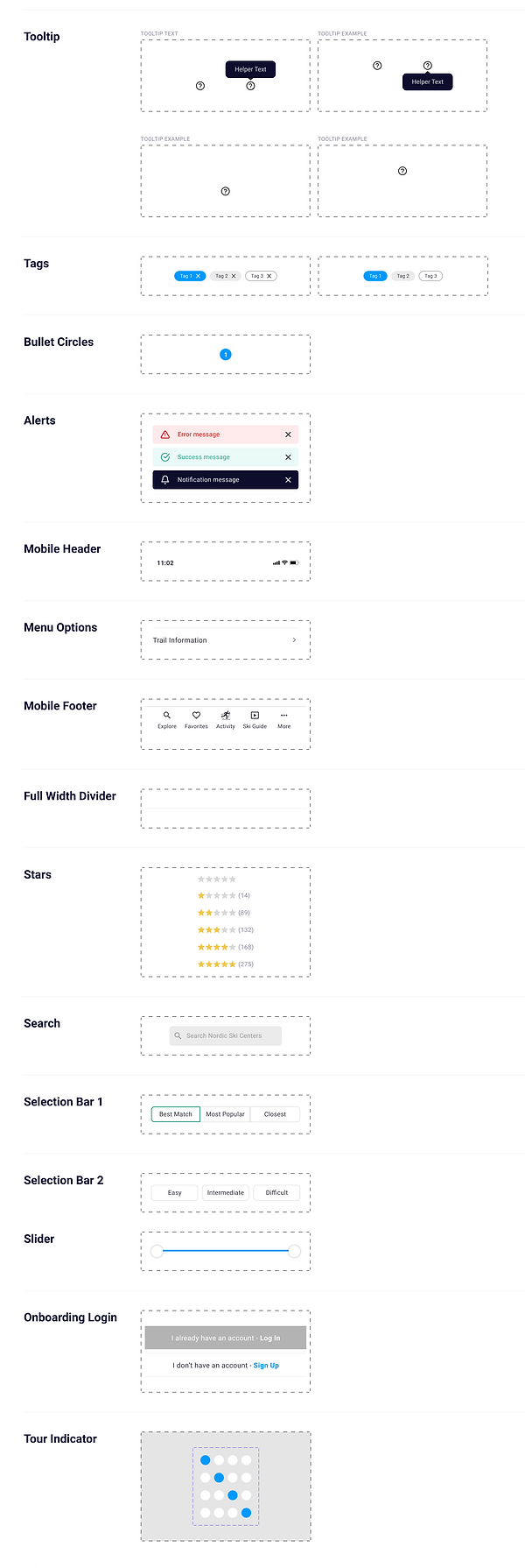
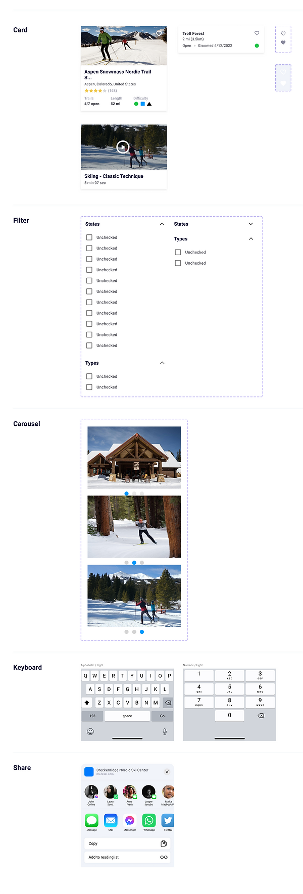
Components
Here are a few examples of components I created in Figma. I've also included a few patterns where I combined multiple components into a more advanced component (pattern).
05. Test
Usability testing
I performed two rounds of usability testing with five participants in each test. For each round we had one in-person moderated, three remote moderated and one remote unmoderated sessions. Each session was 30 min long and for the remote moderated sessions we used Google Meet and for the remote unmoderated sessions we used Maze.
Test plan
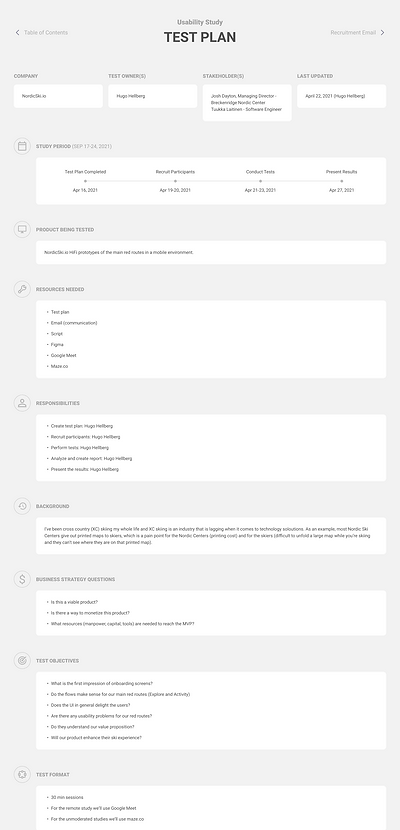
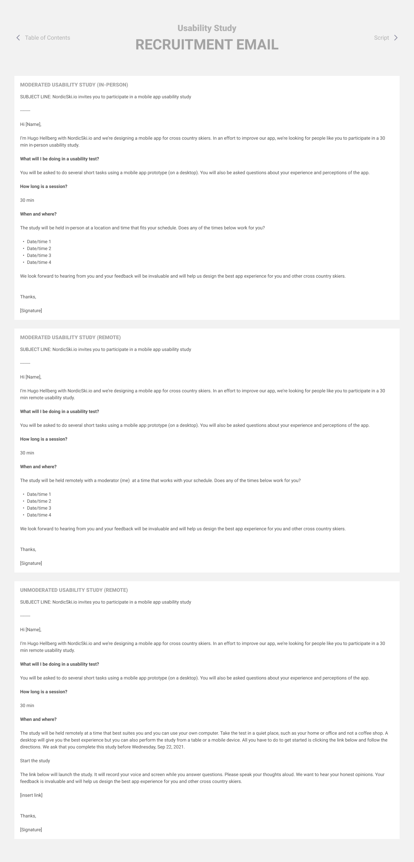
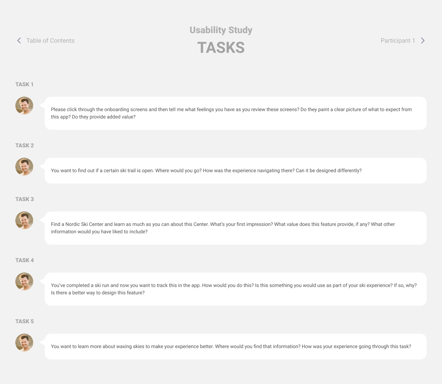
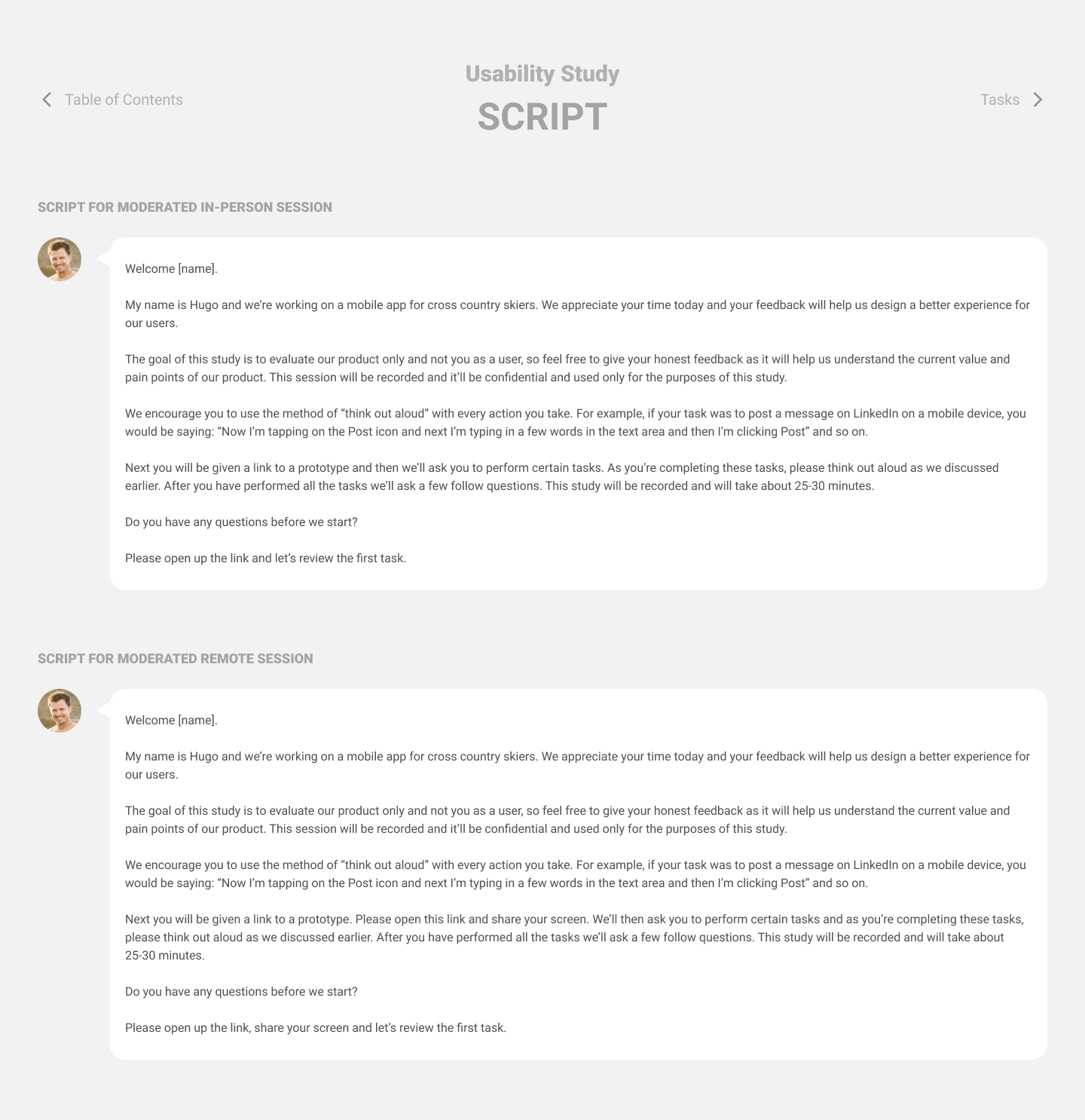
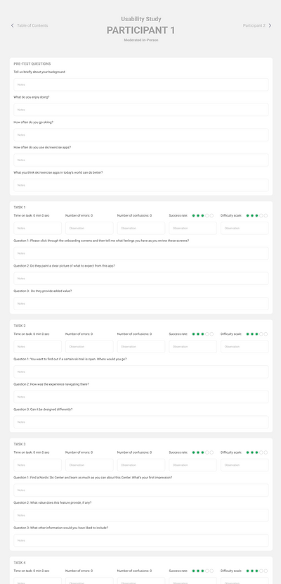
I built an extensive test plan template which included all the details, including recruitment emails, scripts, tasks etc. Below are snippets of the plan.
Test results
During the test session we asked the participants a few pre-task questions to warm up, followed by a few tasks they had to perform and finally we asked them post-task questions. This allowed us up to get the participants comfortable, do a thorough test and get valuable feedback.
The key user flows such as finding a Nordic ski center or trails were completed by participants as expected, although areas for improvement were also identified. For example, in addition to the card view for Nordic ski centers, several users also wanted to have the map view quickly available since that could speed up the ability to find centers and trails nearby.
In addition, they wanted more details available for the Activity module. For the MVP this module was pretty basic and they thought the existing value this feature provided might not be enough to use it. So this is something we had to keep in mind moving forward.
There were positive comments about the UI and that it was easy to navigate and quickly find what they were looking for. However, there were some comments about terminology and how we can make some areas a bit clearer by using different wording.
This gave us valuable insights and we went through a couple of more design iterations before landing at our final design.
Final designs
After two rounds of user testing and many iterations I arrived at the final design. Let's be honest here... The design is never final and we will have many more iterations to come. But for now, this is it!
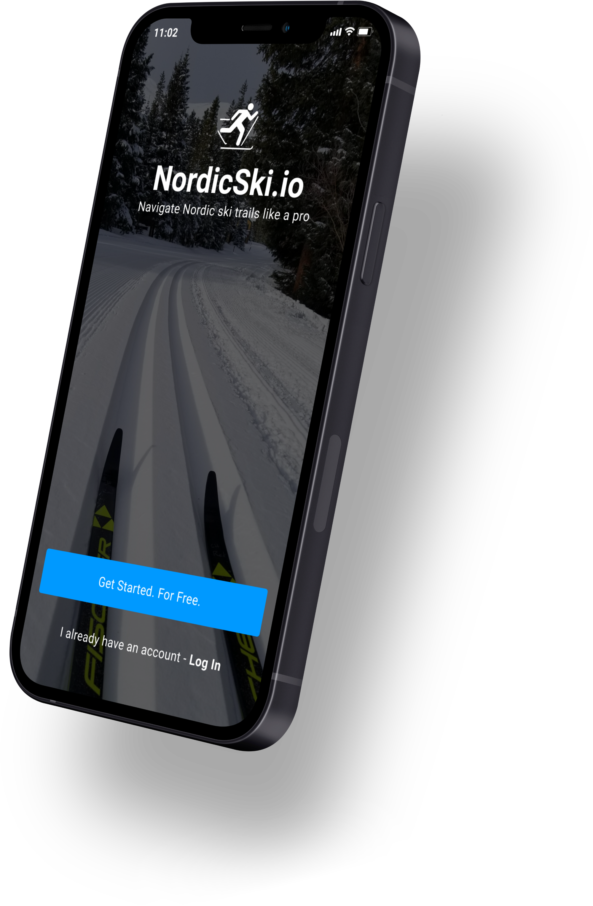
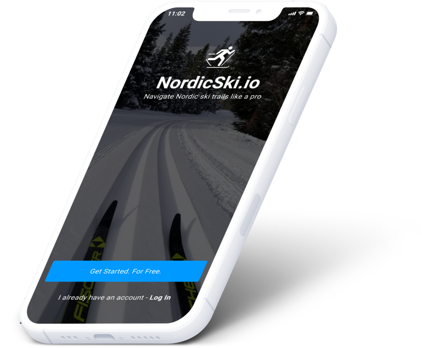
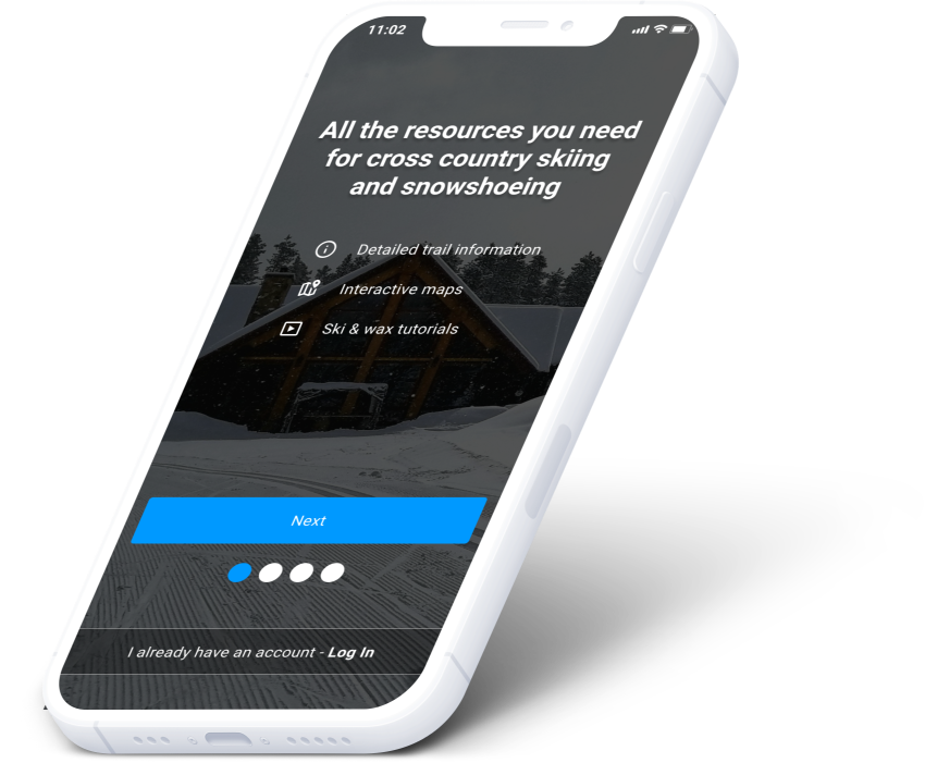
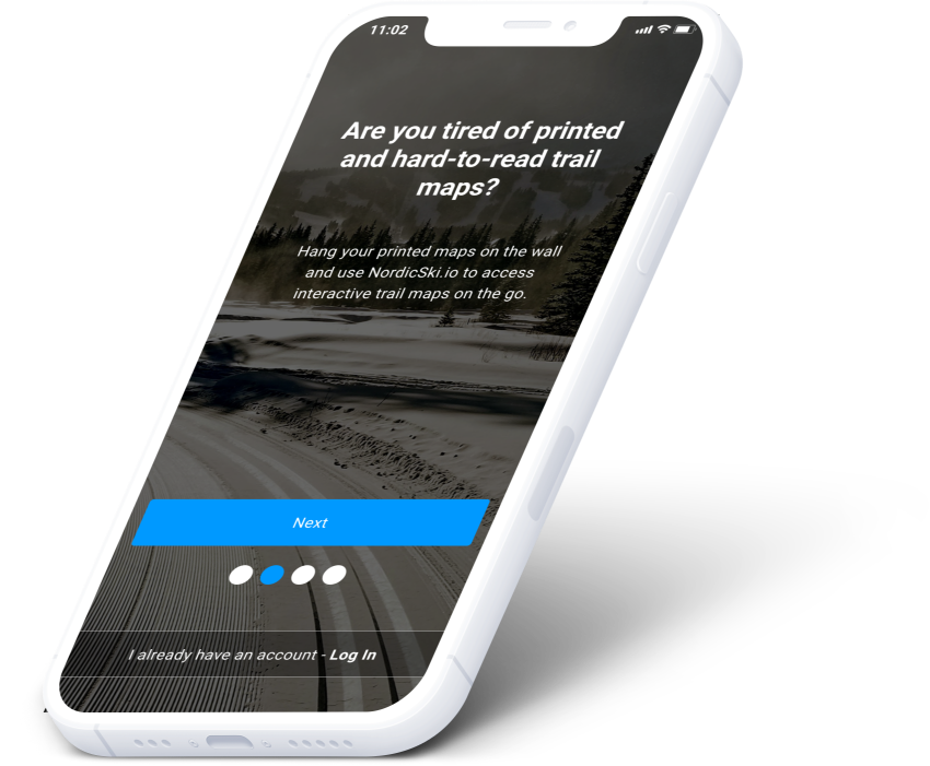
Onboarding screens
Brief overview of the main features offered. Users can click through or swipe through the onboarding screens.
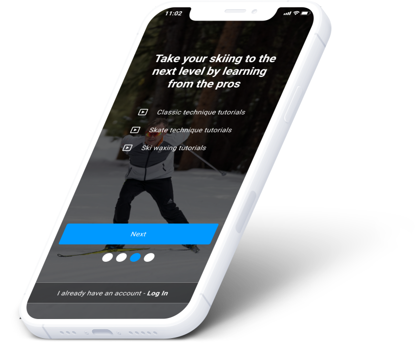
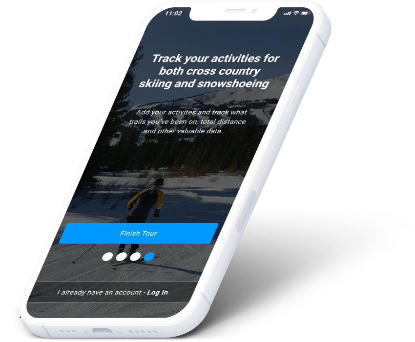
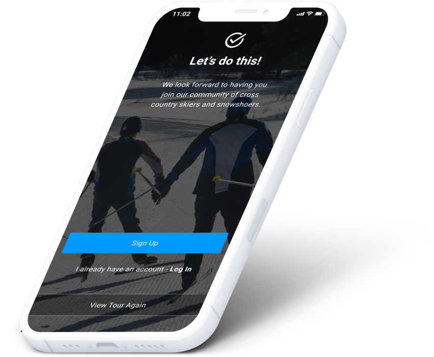
Possible modifications to onboarding screens
Should we add a "Skip Tutorial" link at the top of the screen, to give users the ability to speed up the onboarding process?
Is the onboarding theme too dark?
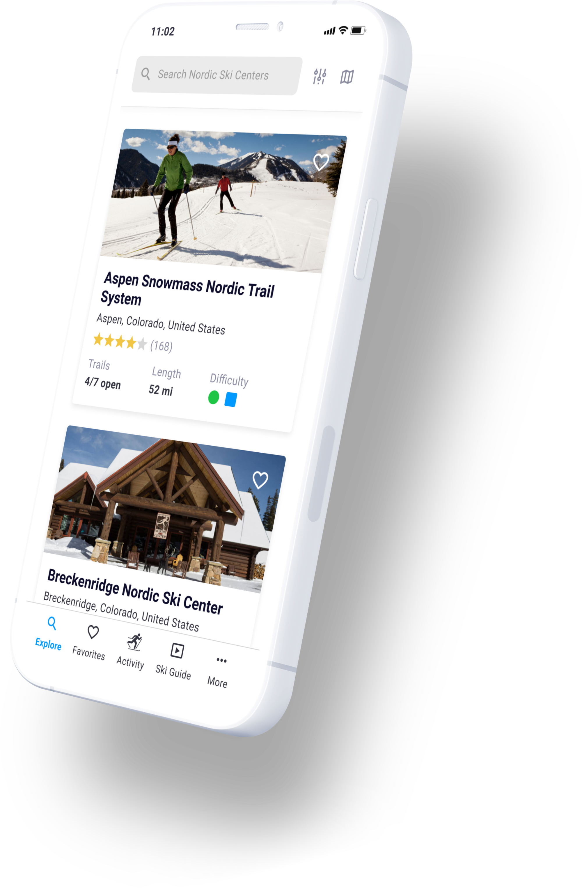
Explore Nordic ski centers
Users can see a list view or map view of all the Nordic ski centers, including a filter and search functionality.
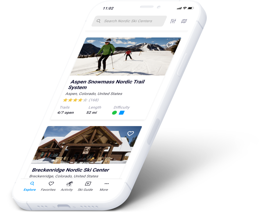
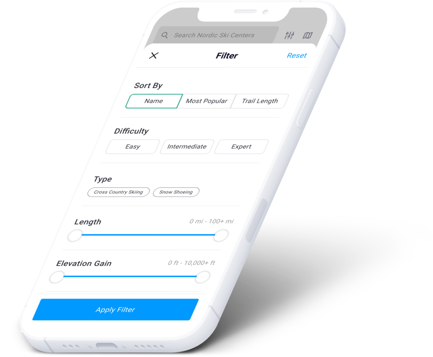
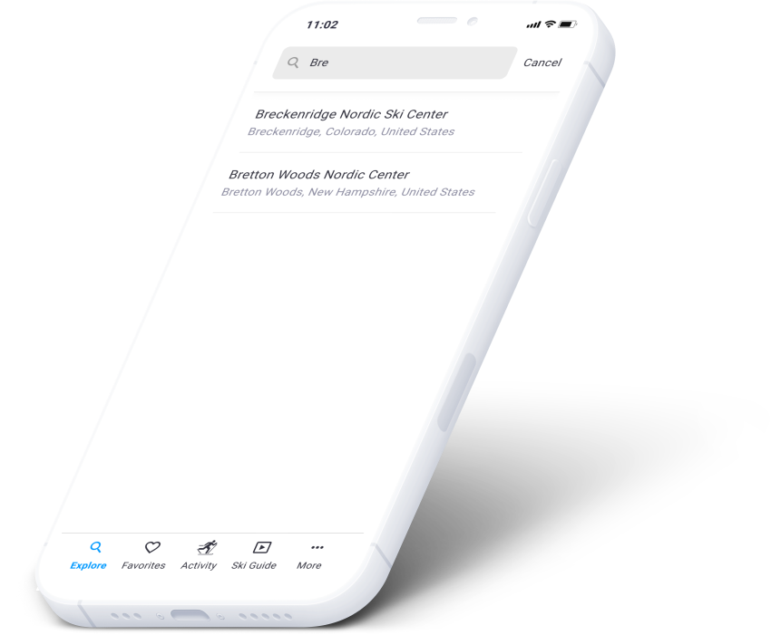
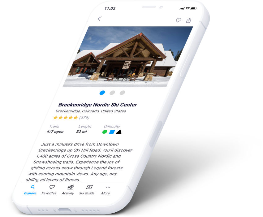
Possible modifications to explore ski center screens
Is there a better way to display the Nordic Ski Center cards?
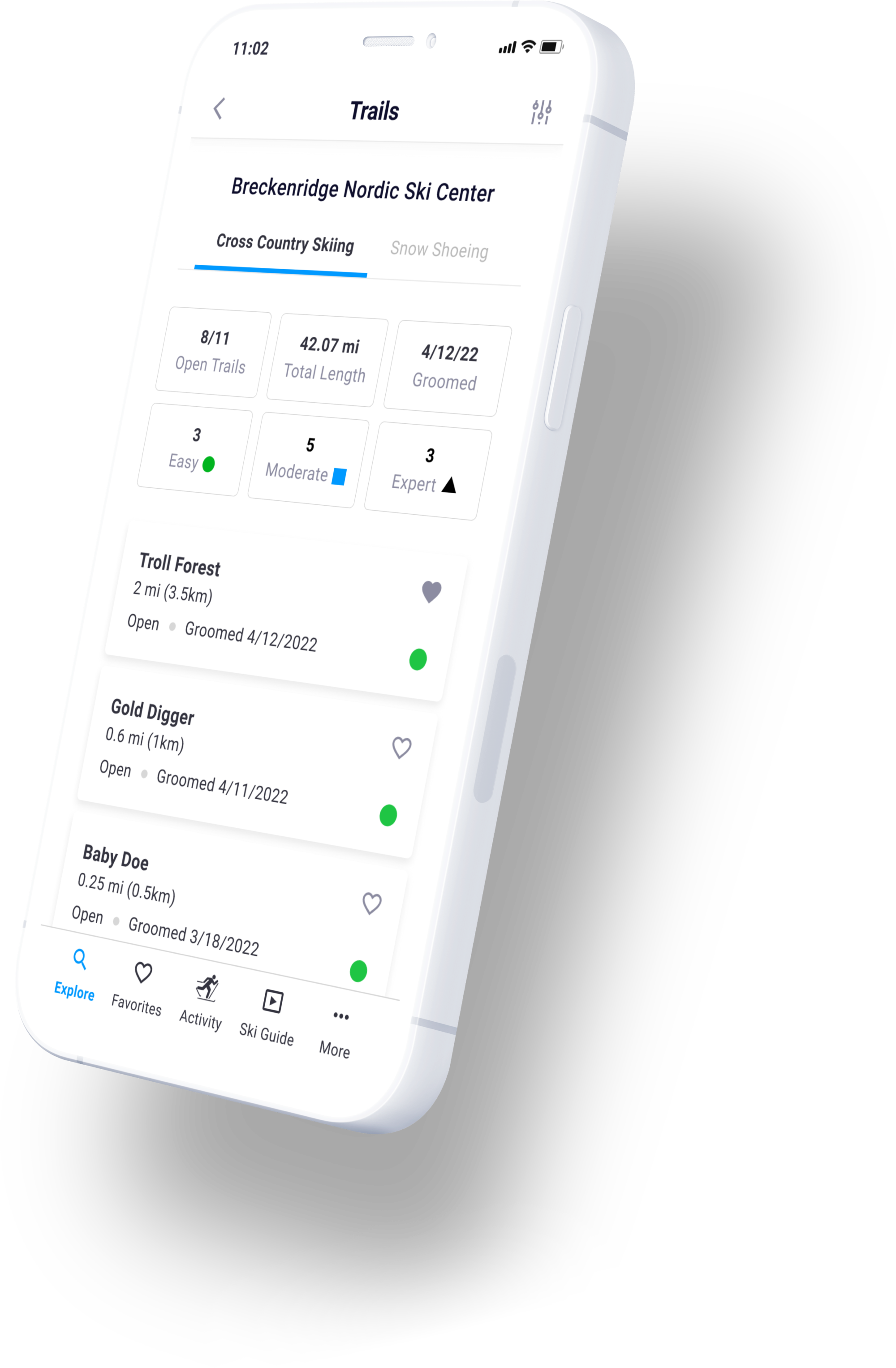
Explore ski trails
Users can see a list view or map view of all the ski trails, including a filter and search functionality.
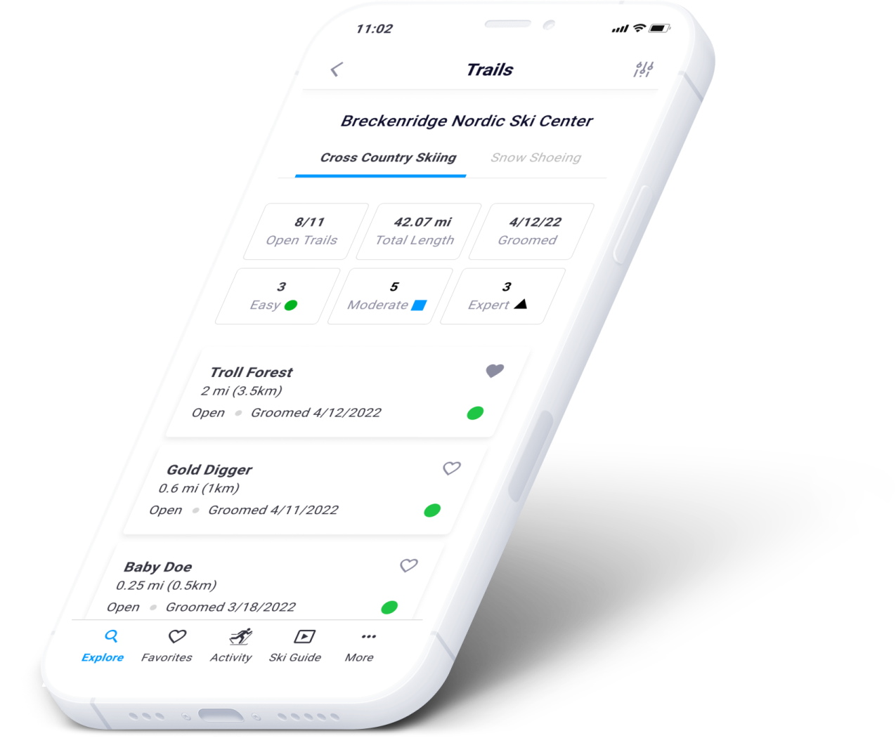
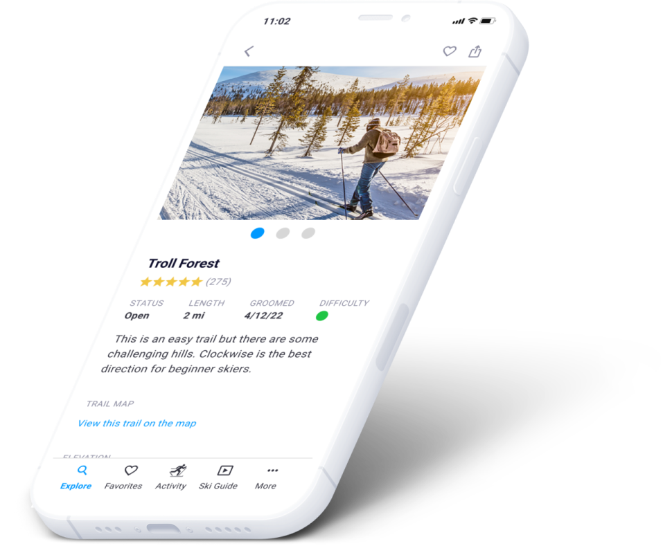
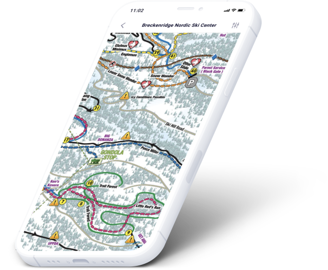
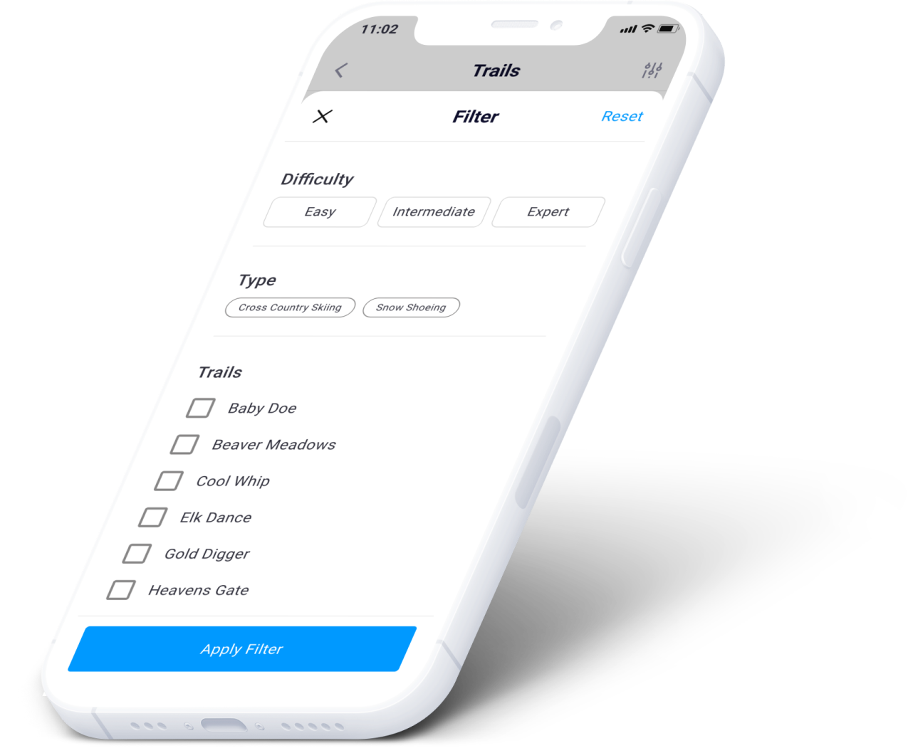
Possible modifications to explore trail screens
Is there too little/much information included?
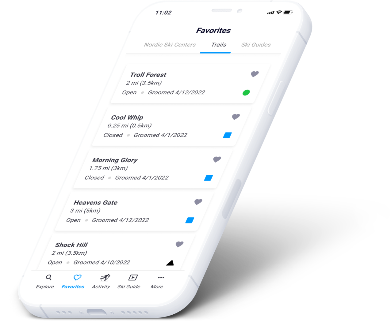
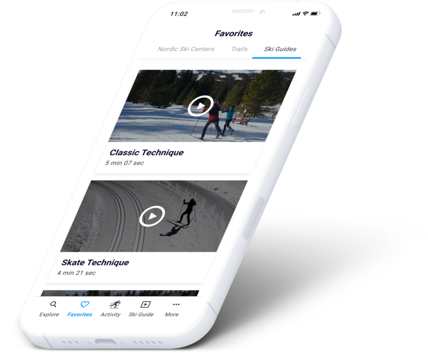
Favorites
Nordic ski centers, trails and tutorial videos (ski guide) can be saved as favorites so users can easily access them.
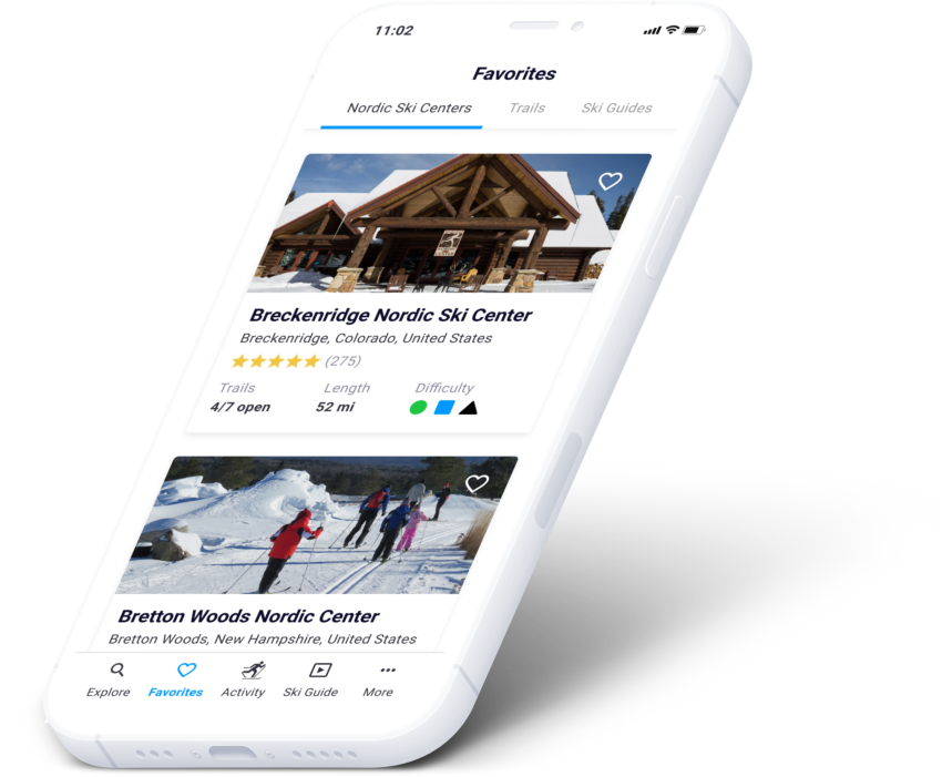
Possible modifications to favorites screens
Is there a better way to show the different lists and switch between them?
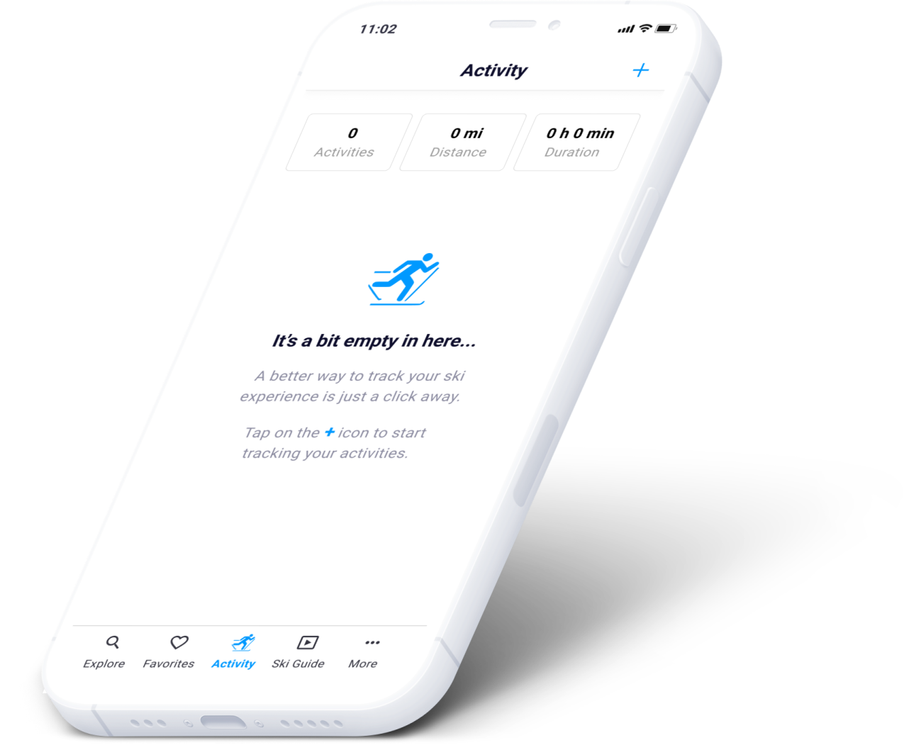
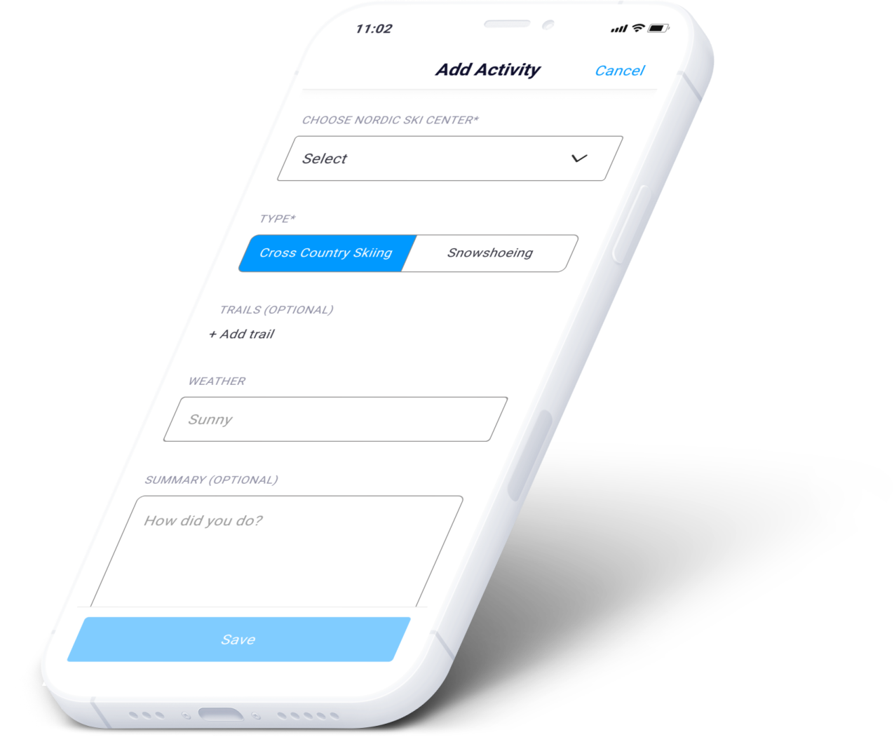
Activity
For the MVP we wanted to have the ability for users to add activities that included detailed trail information and automatically kept track of distance based on what trails you add to your activity.
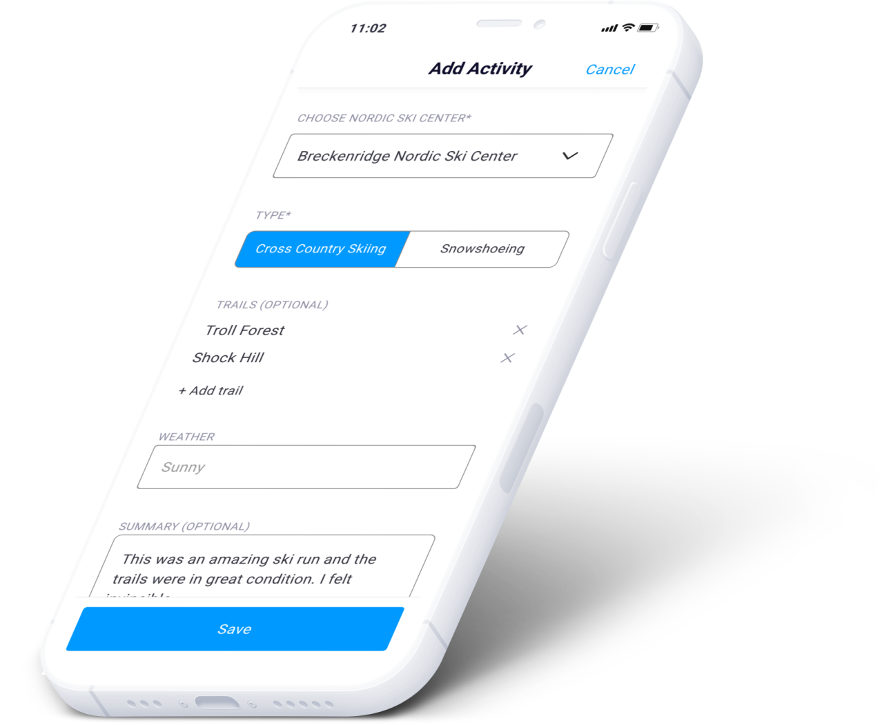
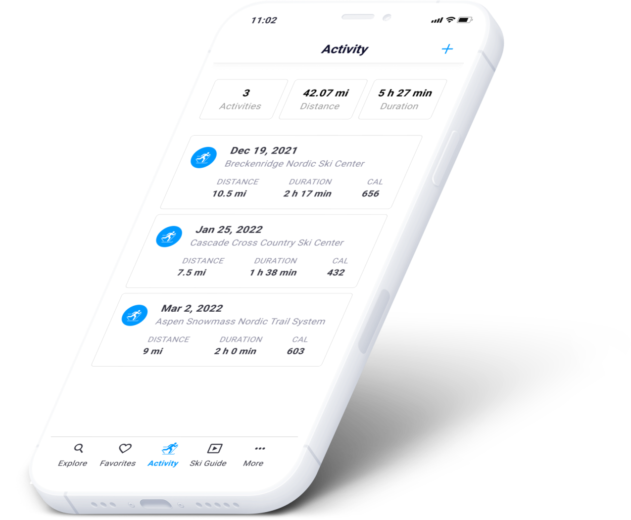
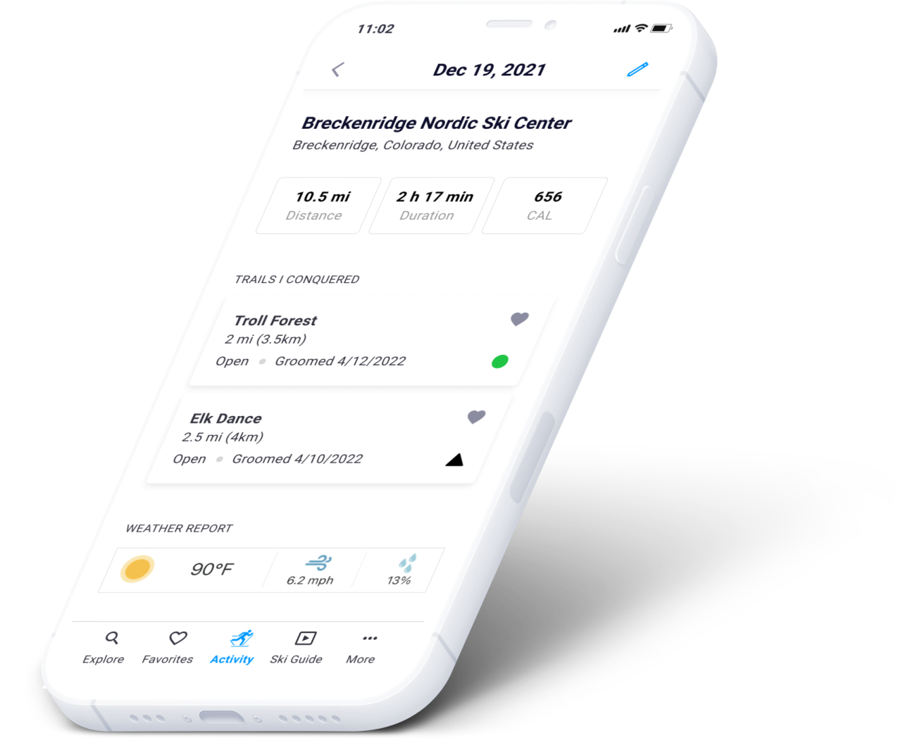
Possible modifications to activity screens
We wanted to eventually add more advanced features to this module, such as automatically track the distance, elevation gain/loss and other valuable data
Ski guide (tutorials)
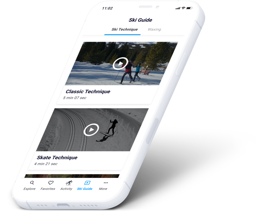
Possible modifications to ski guide screens
Initially there would be enough videos to at least call it a Ski Guide, but we needed to quickly add more videos to offer more relevant content for users
06. Conclusion
After a long journey we arrived at the final design and based on the two rounds of usability tests we performed, we saw very encouraging results. The overall feedback was that this is an app that is much needed for an industry that is lagging when it comes to technology solutions.
Replacing printed maps, that typically are given out to skiers by Nordic ski centers, with an app was the number one sought-after idea. This included being able to see where on the map you are with GPS functionality, view and filter trails on the map and ideally be able to show alerts directly on the map. The usability test participants also liked the video tutorials for ski technique and waxing, in order to learn how to ski faster and more efficiently.
The key user flows such as finding a Nordic ski center or trails were completed by participants as expected, although areas for improvement were also identified. For example, in addition to the card view for Nordic ski centers, several users also wanted to have the map view quickly available since that could speed up the ability to find centers nearby.
Overall, this project gave me tremendous insight into user UX research as well as the entire design process from beginning to end. As I was designing NordicSki.io I took on a strong empathic role to truly understand our users' behaviors and feelings and how this translated into user interface design.